
- 联系我们
- duidaima.com 版权声明
- 闽ICP备2020021581号
-
 闽公网安备 35020302035485号
闽公网安备 35020302035485号

<p>CSS3DEFFECT</p>
body {
    perspective: 160vmin;
}

p {
    font-size: 24vmin;
    transform-style: preserve-3d;
    animation: rotate 10s infinite ease-in-out;
}

@keyframes rotate {
    0% {
        transform: rotateY(-45deg);
    }
    50% {
        transform: rotateY(45deg);
    }
    100% {
        transform: rotateY(-45deg);
    }
}
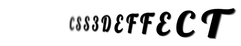
我们就可以得到这样一个 3D 文字效果: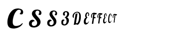
<p>
    <span>C</span>
    <span>S</span>
    <span>S</span>
    <span>3</span>
    <span>D</span>
    <span>E</span>
    <span>F</span>
    <span>F</span>
    <span>E</span>
    <span>C</span>
    <span>T</span>
</p>
完整的代码大概是这样:<!-- 堆代码 duidaima.com -->
@import url('https://fonts.googleapis.com/css2?family=Lobster&display=swap');
$count: 12;
body, html {
font-family: 'Lobster', cursive;
perspective: 160vmin;
overflow: hidden;
}
p {
margin: auto;
font-size: 24vmin;
transform-style: preserve-3d;
animation: rotate 10s infinite ease-in-out;
span {
text-shadow:
1px 1px 0 rgba(0, 0, 0, .9),
2px 2px 0 rgba(0, 0, 0, .7),
3px 3px 0 rgba(0, 0, 0, .5),
4px 4px 0 rgba(0, 0, 0, .3),
5px 5px 0 rgba(0, 0, 0, .1);
&:nth-child(-n+5) {
animation-delay: -5s;
}
}
}
@for $i from 1 to 7 {
span:nth-child(#{$i}),
span:nth-last-child(#{$i}) {
animation: filterBlur-#{$i} 10s infinite ease-in-out;
}
@keyframes filterBlur-#{$i} {
0% {
filter: blur(0px) contrast(5);
}
50% {
filter: blur(#{7 - $i}px) contrast(1);
}
100% {
filter: blur(0px) contrast(5);
}
}
}
@keyframes rotate {
0% {
transform: rotateY(-45deg);
}
50% {
transform: rotateY(45deg);
}
100% {
transform: rotateY(-45deg);
}
}
简单解析下,这里有几个小技巧,仔细观察我们需要的效果:
1.第一个字符和最后一个字符在旋转的最左效果和最右效果下分别会离我们最近和最远,它们的效果其实应该是一致的,所以第一个字符和最后一个字符应该统一处理,依次类推,第二个字符和倒数第二字符统一处理,这里可以借助 SASS 利用 :nth-child 和 :nth-last-child 高效编写 CSS 代码
2.每次有一半是清晰的,一半的是模糊的,需要区分对待,利用 animation-delay 让一半的动画延迟一半进行
3.可以再配合 text-shadow 让文字更立体点
这样,我们可以最终得到如下效果: