
- 联系我们
- duidaima.com 版权声明
- 闽ICP备2020021581号
-
 闽公网安备 35020302035485号
闽公网安备 35020302035485号

h1 {
  color: blue;
}
那时的选择器简单、有效,但非常有限。这就像用蜡笔绘制西斯廷教堂一样。为了增加更多的灵活性,CSS2引入了新的选择器,比如子元素选择器(>)、相邻兄弟选择器(+)和属性选择器([attr=value])。这些选择器可以实现更精确的样式化:/* 堆代码 duidaima.com */
/* Child Selector */
div > p {
color: red;
}
/* Adjacent Sibling Selector */
h1 + p {
margin-top: 20px;
}
/* Attribute Selector */
input[type="text"] {
width: 200px;
}
这些选择器让我们能够表达元素之间更复杂的关系,使我们的样式表更高效和有组织。这是一个进步,但我们仍然需要更多。然后出现了CSS3。它通过更强大的工具扩展了CSS选择器的能力,例如通用兄弟组合器(~)、:not()伪类以及一系列的属性选择器:/* General Sibling Combinator */
h1 ~ p {
font-size: 1.2em;
}
/* :not() Pseudo-class */
div:not(.highlighted) {
opacity: 0.5;
}
/* Attribute Selectors */
a[href*="google"] {
background: url(/images/google-icon.png) no-repeat;
}
我们不再只是对元素进行样式设置,而是与它们互动,探索它们的属性,它们之间的关系。我们开始打造复杂的设计,能够根据内容的结构和含义进行响应式布局。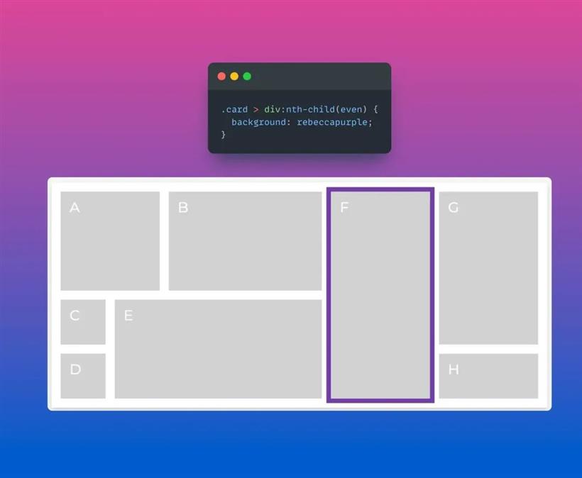
/* :nth-child Selector */
li:nth-child(odd) {
  background: lightgray;
}

/* :checked Pseudo-class */
input[type="checkbox"]:checked {
  border-color: green;
}

/* ::before and ::after Pseudo-elements */
blockquote::before {
  content: "❝";
  font-size: 3em;
}
blockquote::after {
  content: "❞";
  font-size: 3em;
}
还值得一提的选择器是伪类:is。它允许你将多个选择器组合在一条语句中,减少代码的重复性,提高可读性。如果你想深入了解,请查阅Steve的文章《Simpler CSS Selectors With :is()》。#header {
color: blue; /* This will apply because ID selectors have the highest specificity */
}
.container .header {
color: red; /* This won't apply to the element with id "header" */
}
header {
color: green; /* This won't apply to the element with id "header" */
}
了解如何与级联一起工作,而不是对抗它,将能够避免许多问题。使用特异性计算器等工具可以大有裨益。@media only screen and (max-width: 600px) {
body {
background-color: lightblue;
}
}
在这个例子中,当屏幕宽度小于或等于600px时,body的背景色会变成浅蓝色。这使得CSS在创建响应式设计中扮演着重要的角色。button {
transition: background-color 0.5s ease;
}
button:hover {
background-color: blue;
}
在这段代码中,当你将鼠标悬停在按钮上时,它的背景色会在半秒钟的时间内过渡到蓝色。:root {
--brand-color: #32a852;
}
body {
background-color: var(--brand-color);
}
/* On hovering over the body, the brand color changes */
body:hover {
--brand-color: #a83258;
}
将鼠标悬停在页面上,瞧!你的网站样式完全变了个样。这就是CSS变量的威力!<table>
<tr>
<td>Header</td>
</tr>
<tr>
<td>Main Content</td>
<td>Sidebar</td>
</tr>
<tr>
<td>Footer</td>
</tr>
</table>
那是一个我们迫使HTML按照我们的意愿弯曲的时代,将其用于并非原本意图的用途——布局。但嘿,我们让它发挥作用了,对吧?但让我们真实一点,那是一种痛苦。代码难以维护,可访问性受到了影响,响应式设计也只是一个遥远的梦想。我们需要一种改变,而CSS就是那个改变!.column {
float: left;
width: 50%;
}
就这样,我们就有了一个双列布局。听起来很简单,对吧?但问题出现在我们尝试在浮动元素下方添加更多元素时。突然间,我们的页脚就像自己闯荡一样,紧贴在DOM结构中更高的内容旁边。哦,这个混乱!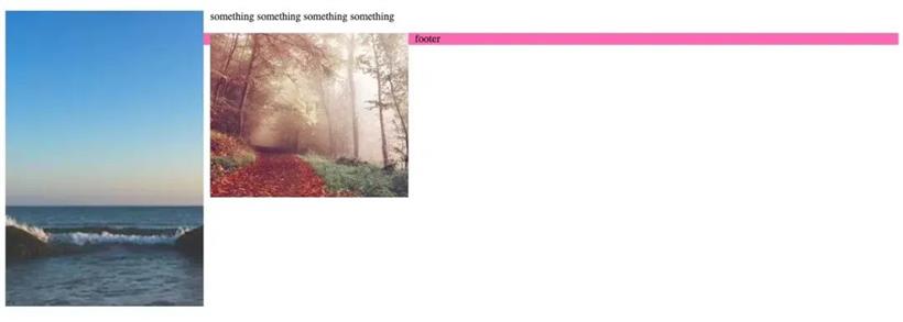
.group:after {
content: "";
display: table;
clear: both;
}
通过在容器中添加一个伪元素:after,并给它设置display: table;和clear: both;,我们有效地清除了浮动。突然间,我们的页脚回到了它们应该在的位置,一切都恢复了正常。尽管浮动具有一些古怪和意外的行为,但掌握浮动对于每个网页开发人员来说是一种成长的必经之路。它教会了我们理解CSS的盒子模型、文档流以及CSS可能表现出的奇妙和奇异的方式的重要性。这是一个具有挑战性的、有时让人抓狂的经历,但它是通向我们今天所熟悉和喜爱的CSS之路上的重要里程碑。.container {
display: flex;
justify-content: space-between;
}
.item {
flex: 1;
}
在这个例子中,我们将容器设置为display: flex;,让其子元素知道它们处于flex上下文中。justify-content: space-between;让我们的项目之间保持良好的间距。然后我们使用flex: 1;给项目添加了相同的宽度,填满了整个容器的空间。简洁而简单。然后是grid布局,下一个重大飞跃。Grid布局在2017年左右引入,将CSS布局提升到了一个全新的水平,同时让我们定义了列和行。CSS grid让我们能够创建复杂的二维布局,在之前是非常困难的。以下是一个简单示例:.container {
display: grid;
grid-template-columns: repeat(3, 1fr);
grid-gap: 10px;
}
.item {
grid-column: span 2;
}
在这段代码中,.container是我们的网格容器。我们使用grid-template-columns: repeat(3, 1fr);定义了三个相等宽度的列,并使用grid-gap: 10px;设置它们之间的间距为10像素。然后对于我们的项目,我们使用grid-column: span 2;使项目跨越两列。那真是强大的功能!如果你研究一下grid-template-areas属性,你就可以成为真正的CSS grid专家。.container {
position: relative;
}
.element {
position: absolute;
top: 50%;
left: 50%;
transform: translate(-50%, -50%);
}
快进到今天,flexbox让居中变得轻而易举:.container {
display: flex;
justify-content: center;
align-items: center;
}
在过去,创建复杂布局通常意味着使用浮动元素,这可能会很棘手且难以管理。以下是使用浮动元素创建双列布局的简化示例:.container::after {
content: "";
display: table;
clear: both;
}
.column {
  float: left;
  width: 50%;
}
如今,借助CSS Grid,你可以用极少的代码创建复杂的布局,而无需头痛的困扰:.container {
display: grid;
grid-template-columns: 1fr 1fr;
}
对未来的一瞥
/* Create a containment context */
.post {
  container-type: inline-size; /* size & normal are valid values as well */
}

/* Default heading styles for the card title */
.card h2 {
  font-size: 1em;
}

/* If the container is larger than 700px */
@container (min-width: 700px) {
  .card h2 {
    font-size: 2em;
  }
}
样式查询<li class="card-container" style="--sunny: true;">
<div class="weather-card">
<div class="day">Saturday</div>
<div class="date">February <span>12</span></div>
<div class="temps">
<div class="high">High: <span>55</span></div>/
<div class="low">Low: <span>47</span></div>
</div>
<div class="features">
Clear skies, sun
</div>
</div>
</li>
<style>
.card-container {
container-name: weather;
}
/* In case the custom propery --sunny: true; change the child */
@container style(--sunny: true) {
.weather-card {
background: linear-gradient(-30deg, yellow, orange);
}
.weather-card:after {
content: url(<data-uri-for-demo-brevity>);
background: gold;
}
}
</style>
:has伪类<article>
<h1>Hello</h1>
<h2>World</h2>
</article>
<style>
/* style parent according to children */
article:has(h1) {
background: lightgray;
}
/* style child by parent content */
article:has(h1) h2 {
color: yellow;
}
/* style sibling by adjacent element */
h1:has(+ h2) {
color: hotpink;
}
</style>
text-wrap: balance
.parent {
  color: blue;

  .child {
    color: red;
  }
}
此外,你还可以嵌套媒体查询(和容器查询):.card {
display: flex;
gap: 1rem;
@media (width >= 480px) {
display: grid;
}
}
另外,第一个例子也可以这样写:.parent {
color: blue;
& .child {
color: red;
}
}
子网格<div class="grid">
<div class="item">
<div class="subitem"></div>
</div>
</div>
<style>
/* some styles removed for brevity */
.grid {
display: grid;
grid-template-columns: repeat(9, 1fr);
grid-template-rows: repeat(4, minmax(100px, auto));
}
.item {
display: grid;
grid-column: 2 / 7;
grid-row: 2 / 4;
grid-template-columns: subgrid;
grid-template-rows: subgrid;
background-color: #ffd8a8;
}
.subitem {
grid-column: 3 / 6;
grid-row: 1 / 3;
background-color: rgb(40, 240, 83); /* green */
}
</style>
Scoped CSS@scope (.card) {
/* only affects a .title that is within a .card */
.title {
font-weight: bold;
}
}
滚动驱动的动画
级联层(@layer)
现在得到了广泛支持,在存在多个级联层的情况下,定义了优先级的顺序。您可以根据重要性对样式表进行排序:@layer base {
a {
font-weight: 800;
color: red; /* ignored */
}
.link {
color: blue; /* ignored */
}
}
@layer typography {
a {
color: green; /* styles *all* links */
}
}
@layer utilities {
.pink {
color: hotpink; /* styles *all* .pink's */
}
}
View transitionsfunction spaNavigate(data) {
// Fallback for browsers that don't support this API:
if (!document.startViewTransition) {
updateTheDOMSomehow(data);
return;
}
// With a transition:
document.startViewTransition(() => updateTheDOMSomehow(data));
}
然后 CSS 接管:@keyframes slide-from-right {
from { opacity: 0; transform: translateX(75px); }
}
@keyframes slide-to-left {
to { opacity: 0; transform: translateX(-75px); }
}
::view-transition-old(root) {
animation: 350ms both slide-to-left ease;
}
::view-transition-new(root) {
animation: 350ms both slide-from-right ease;
}
结束