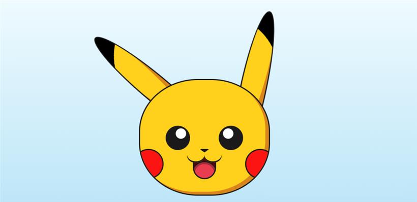
一. 实现思路
耳朵,耳朵尖,头部,脸夹,眼睛,眼珠子,鼻子,可爱的小嘴,舌头涉及到的CSS3属性,radial-gradient 的背景填充,animation 的耳朵尖动画,头部border-radius的圆角边框,右下角box-shadow的阴影显示,眼睛和眼珠子的定位,这里采用了::before,鼻子类似于用css实现一个三角形的写法,15px solid transparent ,脸夹是背景颜色的设置,圆角边框的实现,以及定位,小嘴巴涉及到了 box-shadow :inset 0px -4px 0 #1b1919 的阴影,或者做一个圆角也可以实现。
HTML部分源代码
<div class="pikachu">
  <div class="left-ear"></div>
  <div class="right-ear"></div>
  <div class="head">
    <div class="left-eye"></div>
    <div class="right-eye"></div>
    <div class="nose"></div>
    <div class="left-cheek"></div>
    <div class="right-cheek"></div>
    <div class="lips"></div>
    <div class="mouth"></div>
  </div>
</div>
CSS源代码
<style> /* 开始样式标签 */
body {
  display: flex; /* 设置为弹性布局 */
  height: 100vh; /* 高度占据视口的100% */
  width: 100vw; /* 宽度占据视口的100% */
  align-items: center; /* 垂直居中 */
  justify-content: center; /* 水平居中 */
  background: linear-gradient(#f2fcff, #b9e4f7); /* 背景线性渐变 */
  overflow: hidden; /* 溢出隐藏 */
}

.pikachu {
  position: relative; /* 相对定位 */
}

@media (max-width: 600px) {
  .pikachu {
    transform: scale(0.5); /* 在小于600px宽度时缩小为50% */
  }
}

.head {
  position: relative; /* 相对定位 */
  margin-top: 200px; /* 顶部边距为200px */
  width: 370px; /* 宽度为370px */
  height: 330px; /* 高度为330px */
  background: #ffd01c; /* 背景色 */
  border: 4px solid #1b1919; /* 边框 */
  border-radius: 45%; /* 边框圆角 */
  overflow: hidden; /* 溢出隐藏 */
  box-shadow: inset -10px -8px 0 #d8851c; /* 内阴影 */
}

.left-eye,
.right-eye {
  position: absolute; /* 绝对定位 */
  width: 70px; /* 宽度为70px */
  height: 70px; /* 高度为70px */
  background-color: #1b1919; /* 背景色 */
  border-radius: 50%; /* 边框圆角 */
  top: 40%; /* 顶部位置为父容器的40% */
}

.left-eye::before,
.right-eye::before {
  content: ""; /* 伪元素内容为空 */
  position: absolute; /* 绝对定位 */
  width: 30px; /* 宽度为30px */
  height: 30px; /* 高度为30px */
  background-color: white; /* 背景色 */
  border-radius: 50%; /* 边框圆角 */
  top: 10%; /* 顶部位置为父容器的10% */
  animation: 0.2s infinite shaking; /* 动画效果 */
}

.left-eye {
  left: 20%; /* 左侧位置为父容器的20% */
}

.left-eye::before {
  left: 40%; /* 左侧位置为父容器的40% */
}

.right-eye {
  right: 20%; /* 右侧位置为父容器的20% */
}

.right-eye::before {
  right: 40%; /* 右侧位置为父容器的40% */
}

.nose {
  position: relative; /* 相对定位 */
  width: 0; /* 宽度为0 */
  height: 0; /* 高度为0 */
  border-top: 10px solid #1b1919; /* 上边框 */
  border-left: 15px solid transparent; /* 左边框透明 */
  border-right: 15px solid transparent; /* 右边框透明 */
  border-bottom: 10px solid transparent; /* 下边框透明 */
  border-radius: 8px; /* 边框圆角 */
  margin: auto; /* 外边距自动 */
  top: 60%; /* 顶部位置为父容器的60% */
}

.left-cheek,
.right-cheek {
  position: absolute; /* 绝对定位 */
  width: 80px; /* 宽度为80px */
  height: 80px; /* 高度为80px */
  background-color: #fb1412; /* 背景色 */
  border: 4px solid #1b1919; /* 边框 */
  border-radius: 50%; /* 边框圆角 */
  top: 60%; /* 顶部位置为父容器的60% */
}

.left-cheek {
  left: -5%; /* 左侧位置为父容器的-5% */
}

.right-cheek {
  right: -5%; /* 右侧位置为父容器的-5% */
}

.lips {
  display: block; /* 显示为块级元素 */
  position: relative; /* 相对定位 */
  margin: auto; /* 外边距自动 */
  width: 1px; /* 宽度为1px */
  height: 1px; /* 高度为1px */
  top: 60%; /* 顶部位置为父容器的60% */
  z-index: 2; /* 层级 */
}

.lips::after, .lips::before {
  position: absolute; /* 绝对定位 */
  content: ""; /* 伪元素内容为空 */
  top: -20px; /* 顶部位置为-20px */
  width: 50px; /* 宽度为50px */
  height: 40px; /* 高度为40px */
  border-radius: 50%; /* 边框圆角 */
  box-shadow: inset 0px -4px 0 #1b1919; /* 内阴影 */
  background-color: #ffd01c; /* 背景色 */
}

.lips::before {
  right: 0px; /* 右侧位置为0px */
}

.lips::after {
  left: 0px; /* 左侧位置为0px */
}

.mouth {
  position: relative; /* 相对定位 */
  height: 60px; /* 高度为60px */
  width: 60px; /* 宽度为60px */
  margin: auto; /* 外边距自动 */
  top: 60%; /* 顶部位置为父容器的60% */
  border: 4px solid #1b1919; /* 边框 */
  border-radius: 0 0 50% 50%; /* 边框圆角 */
  z-index: 1; /* 层级 */
  background-image: radial-gradient(circle at center 80%, #e93c4e 0%, #e93c4e 50%, #9e2d38 50%, #9e2d38 60%, #1b1919 60%, #1b1919 65%, #5c0009 65%); /* 背景渐变 */
  background-position: 80% center; /* 背景位置 */
}

.left-ear,
.right-ear {
  position: absolute; /* 绝对定位 */
  height: 450px; /* 高度为450px */
  width: 70px; /* 宽度为70px */
  background: #ffd01c; /* 背景色 */
  border-radius: 50%; /* 边框圆角 */
  border: 4px solid #1b1919; /* 边框 */
  box-shadow: inset -4px -120px 0 #d8851c; /* 内阴影 */
}

.right-ear {
  right: 10px; /* 右侧位置为10px */
  transform: rotate(12deg); /* 旋转12度 */
  background-image: radial-gradient(circle at -100% 45%, #ffd01c 0%, #ffd01c 60%, black 60%); /* 背景渐变 */
}

.left-ear {
  left: 10px; /* 左侧位置为10px */
  transform: rotate(-50deg); /* 旋转-50度 */
  background-image: radial-gradient(circle at 200% 45%, #ffd01c 0%, #ffd01c 60%, black 60%); /* 背景渐变 */
  animation: 5s 5s infinite wiggle; /* 动画效果 */
  animation-fill-mode: forwards; /* 动画填充模式 */
  animation-direction: alternate; /* 动画方向 */
}

@keyframes shaking {
  from {
    transform: translateX(0%); /* 从0%位置开始移动 */
  }
  to {
    transform: translateX(2%); /* 移动到2%位置 */
  }
}

@keyframes wiggle {
  0% {
    transform: rotate(-50deg); /* 旋转-50度 */
  }
  5% {
    transform: rotate(-60deg); /* 旋转-60度 */
  }
  10% {
    transform: rotate(-50deg); /* 旋转-50度 */
  }
  12% {
    transform: rotate(-55deg); /* 旋转-55度 */
  }
  15% {
    transform: rotate(-50deg); /* 旋转-50度 */
  }
  100% {
    transform: rotate(-50deg); /* 旋转-50度 */
  }
}
</style> /* 结束样式标签 */
最终画出了可爱的皮卡丘,快拿到代码去感受一下吧。

 闽公网安备 35020302035485号