
- 联系我们
- duidaima.com 版权声明
- 闽ICP备2020021581号
-
 闽公网安备 35020302035485号
闽公网安备 35020302035485号

CSS定位属性是用于控制网页中元素位置的一种方式,它能够让元素在页面上精准地落在我们想要的位置。
在CSS中,定位(Positioning)是控制元素在页面上如何定位和显示的一种机制。它主要包括四种属性:静态定位(static)、相对定位(relative)、绝对定位(absolute)、固定定位(fixed)。
每种定位方式都有其独特的特点和使用场景,下面将分别介绍这几种定位属性。
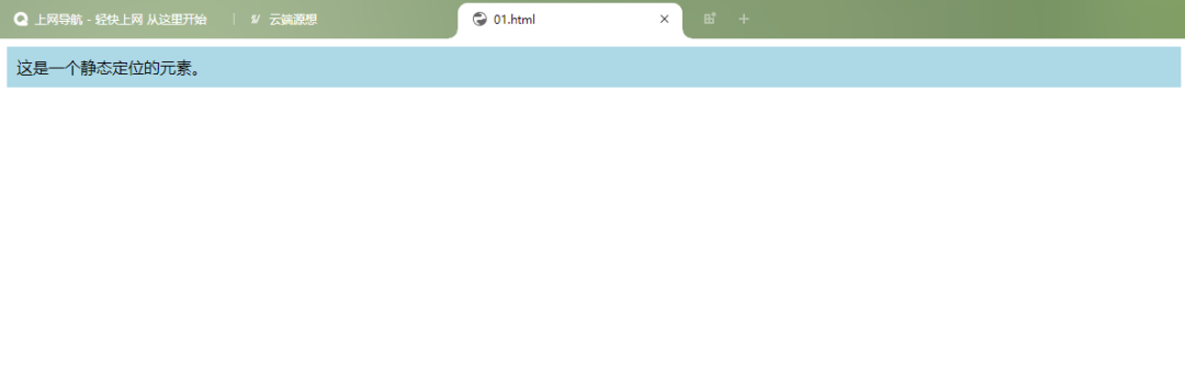
静态定位是元素的默认定位方式,元素按照正常的文档流进行排列。在静态定位状态下,不能配合top、bottom、left、right来改变元素的位置。
代码示例:
<!DOCTYPE html>
<html>
<head>
<style>
.static {
  background-color: lightblue;
  padding: 100px;
}
</style>
</head>
<body>


<div>这是一个静态定位的元素。</div>


</body>
</html>
固定定位使元素相对于浏览器窗口进行定位,即使页面滚动,元素也会保持在固定的位置。
示例代码:
<!DOCTYPE html>
<html>
<head>
    <meta charset="UTF-8">
    <meta http-equiv="X-UA-Compatible" content="IE=edge">
    <meta name="viewport" content="width=device-width, initial-scale=1.0">
    <title>Document</title>
    <style>
        *{
            margin: 0;
            padding: 0;
        }
        body{
            /* 给整个页面设置高度,出滚动条以便观察 */
            height: 5000px;
        }
        div{
            width: 100px;
            height: 100px;
            background-color: blue;
            /* 固定定位 */
            position: fixed;
            right: 100px;
            bottom: 100px;
        }
</style>
</head>
<body>
    <div></div>
</body>
</html>
运行结果:
移动前
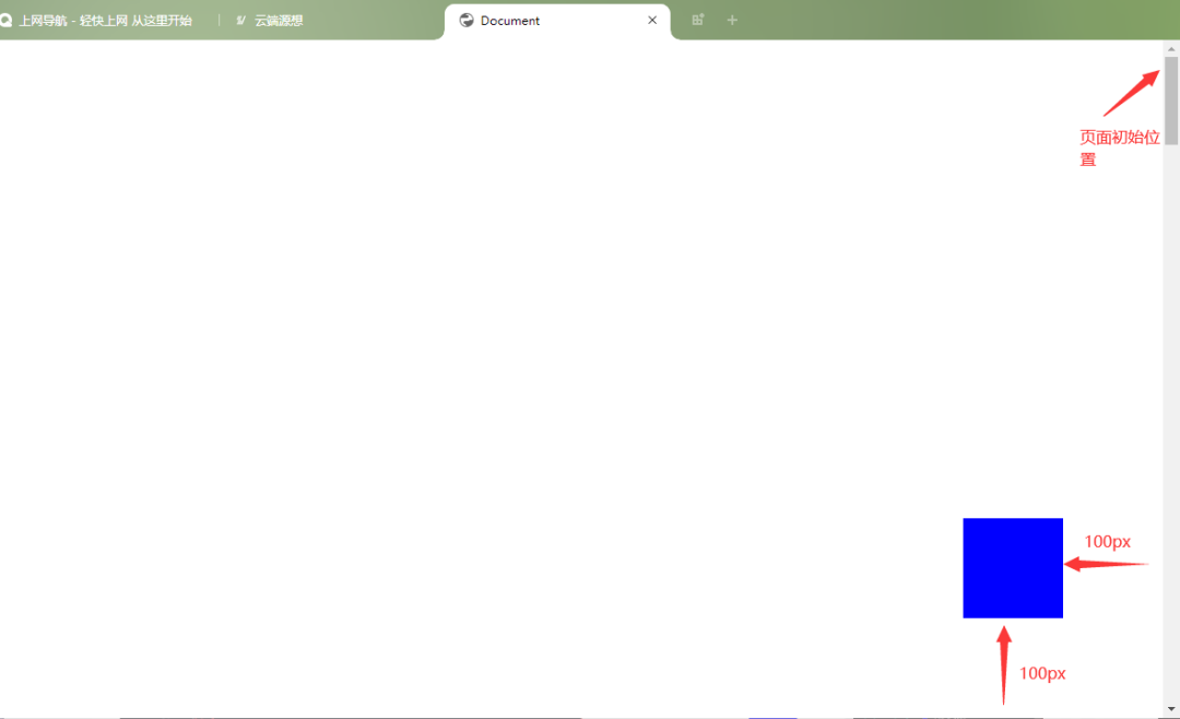
移动后
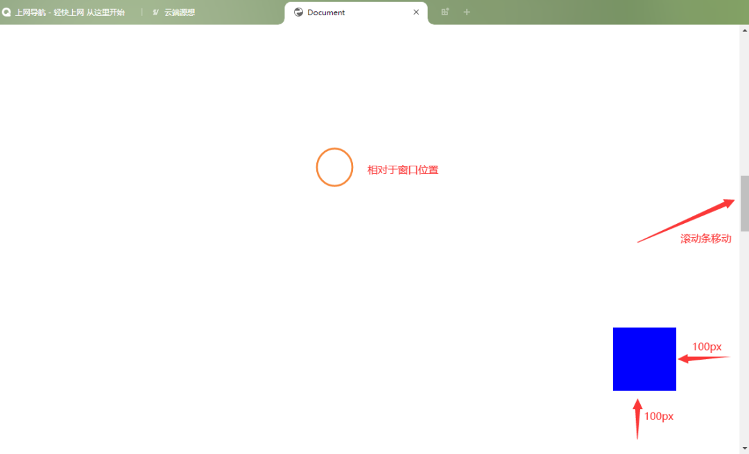
比如我们经常看到的网页右下角显示的“返回到顶部”,就可以用固定定位来实现。
<!DOCTYPE html>
<html>
<head>
    <meta charset="UTF-8">
    <meta http-equiv="X-UA-Compatible" content="IE=edge">
    <meta name="viewport" content="width=device-width, initial-scale=1.0">
    <title>Document</title>
    <style>
        body {
            position: relative;
        }
        .content {
            /* 页面内容样式 */
        }
        #backToTop {
            position: fixed;
            bottom: 20px;
            right: 20px;
            background-color: #333;
            color: #fff;
            border: none;
            padding: 10px;
            cursor: pointer;
        }
</style>
</head>
<body style="height: 5000px;">
    <div>

    </div>
    <button id="backToTop" onclick="scrollToTop()">返回顶部</button>
    <script>
        function scrollToTop() {
            window.scrollTo({top: 0, behavior: 'smooth'});
        }
</script>
</body>
</html>
运行结果:

相对定位是将元素对于它在标准流中的位置进行定位,通过设置边移属性top、bottom、left、right,使指定元素相对于其正常位置进行偏移。如果没有定位偏移量,对元素本身没有任何影响。
不使元素脱离文档流,空间会保留,不影响其他布局。
代码示例:
<!DOCTYPE html>
<html>
<head>
    <meta charset="UTF-8">
    <meta name="viewport" content="width=device-width, initial-scale=1.0">
    <title>Document</title>
    <style>
        .box1{
            width:200px;
            height:100px;
            background:skyblue;
            margin:10px;
        }
        .box2{
            width:200px;
            height:100px;
            background:pink;
            margin:10px;
            position:relative;/*相对定位*/
            left:100px;/*向右偏移100px*/
            top:-50px;/*向上偏移50px*/
        }
        .box3{
            width:200px;
            height:100px;
            background:yellowgreen;
            margin:10px;
        }
</style>
</head>
<body>
    <div>1</div>
    <div>2</div>
    <div>3</div>
</body>
</html>
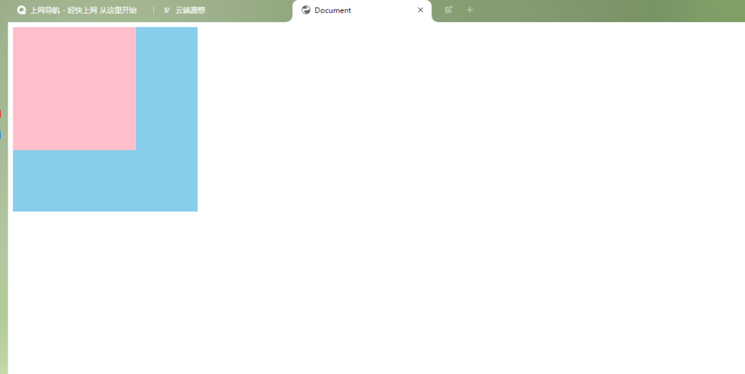
运行结果:
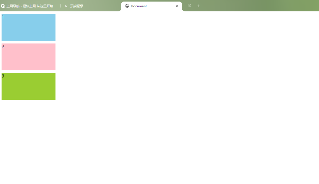
没使用相对定位之前是这样的:
使用相对定位后:相对于原来的位置向右偏移了100px,向上偏移50px。
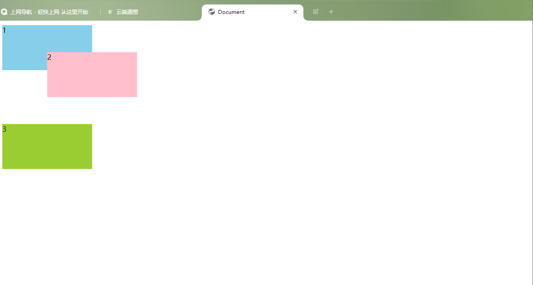
虽然它的位置发生了变化,但它在标准文档流中的原位置依然保留。
绝对定位使元素相对于最近的非 static 定位祖先元素进行定位。如果没有这样的元素,则相对于初始包含块(initial containing block)。绝对定位的元素会脱离正常的文档流。
如果该元素为内联元素,则会变成块级元素,可直接设置其宽和高的值(让内联具备快特性);
如果该元素为块级元素,使其宽度根据内容决定。(让块具备内联的特性)
<style>
.wrap{
width:500px;
height:400px;
border: 2px solid red;
}
.box1{
width:200px;
height:100px;
background:skyblue;
margin:10px;
}
.box2{
width:200px;
height:100px;
background:pink;
margin:10px;
position:absolute;/*绝对定位*/
left:100px;/*向右偏移100px*/
top:30px;/*向下偏移30px*/
}
.box3{
width:200px;
height:100px;
background:yellowgreen;
margin:10px;


}
</style>
<div>
       <div>1</div>
       <div>2</div>
       <div>3</div>
       </div>
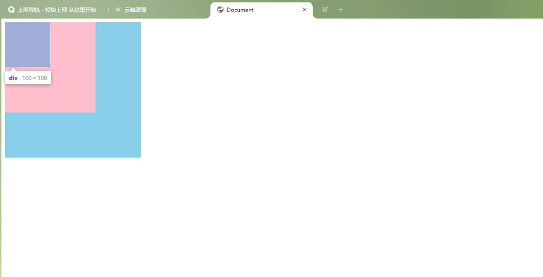
将第二个设置为绝对定位后,它脱离了文档流可以定位到页面的任何地方,在标准文档流中的原有位置会空出来,所以第三个会排到第一个下面。
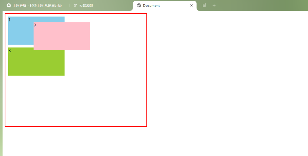
第二个相对于它的父元素向右偏移100,向下偏移30。
想要快速入门前端开发吗?推荐一个前端开发基础课程,这个老师讲的特别好,零基础学习无压力,知识点结合代码,边学边练,可以免费试看试学,还有各种辅助工具和资料,非常适合新手!点这里前往学习哦!
层叠顺序决定了元素之间的堆叠顺序。z-index 属性用于设置元素的层叠顺序。具有较高 z-index 值的元素会覆盖具有较低 z-index 值的元素。
注意:
代码示例:
<!DOCTYPE html>
<html>
<head>
    <meta charset="UTF-8">
    <meta http-equiv="X-UA-Compatible" content="IE=edge">
    <meta name="viewport" content="width=device-width, initial-scale=1.0">
    <title>Document</title>
    <style>
        div:nth-of-type(1){
            width: 300px;
            height: 300px;
            background-color: skyblue;
            position: absolute;
        }
        div:nth-of-type(2){
            width: 200px;
            height: 200px;
            background-color: pink;
            position: absolute;
        }
        div:nth-of-type(3){
            width: 100px;
            height: 100px;
            background-color: yellowgreen;
            position: absolute;
            z-index: -1;
        }
</style>
</head>
<body>

    <div></div>
    <div></div>
    <div></div>


</body>
</html>
运行结果:
可以看到,最后一个div依然存在,但是看不见了,原因就是我们改变了z-index属性值。
以上就是CSS定位属性的介绍了,通过这些定位属性,可以灵活地控制网页中元素的位置和堆叠顺序。
在实际应用中,CSS定位属性的使用需要考虑到整体布局和用户体验。合理运用这些定位技巧,可以让你的网页不仅美观,而且易于使用和维护。记住,好的设计总是细节和功能的完美结合。