
- 联系我们
- duidaima.com 版权声明
- 闽ICP备2020021581号
-
 闽公网安备 35020302035485号
闽公网安备 35020302035485号

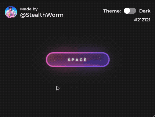
作为前端开发者,我们不仅仅是制作写页面和与后端 API 打交道,偶尔也需要调味剂。今天就分享一个用CSS实现的超酷的星空按钮效果,废话不多说,让我们一起来解读这些 CSS 代码吧。
HTML部分
<button class="btn" type="button">
  <strong>SPACE</strong>
  <div id="container-stars">
    <div id="stars"></div>
  </div>

  <div id="glow">
    <div class="circle"></div>
    <div class="circle"></div>
  </div>
</button>
CSS部分.btn {
display: flex;
justify-content: center;
align-items: center;
width: 13rem;
height: 3rem;
background-size: 300% 300%;
backdrop-filter: blur(1rem);
border-radius: 5rem;
transition: 0.5s;
animation: gradient_301 5s ease infinite;
border: double 4px transparent;
background-image: linear-gradient(#212121, #212121), linear-gradient(137.48deg, #ffdb3b 10%,#FE53BB 45%, #8F51EA 67%, #0044ff 87%);
background-origin: border-box;
background-clip: content-box, border-box;
}
<!--堆代码 duidaima.com -->
#container-stars {
position: fixed;
z-index: -1;
width: 100%;
height: 100%;
overflow: hidden;
transition: 0.5s;
backdrop-filter: blur(1rem);
border-radius: 5rem;
}
strong {
z-index: 2;
font-family: 'Avalors Personal Use';
font-size: 12px;
letter-spacing: 5px;
color: #FFFFFF;
text-shadow: 0 0 4px white;
}
#glow {
position: absolute;
display: flex;
width: 12rem;
}
.circle {
width: 100%;
height: 30px;
filter: blur(2rem);
animation: pulse_3011 4s infinite;
z-index: -1;
}
.circle:nth-of-type(1) {
background: rgba(254, 83, 186, 0.636);
}
.circle:nth-of-type(2) {
background: rgba(142, 81, 234, 0.704);
}
.btn:hover #container-stars {
z-index: 1;
background-color: #212121;
}
.btn:hover {
transform: scale(1.1)
}
.btn:active {
border: double 4px #FE53BB;
background-origin: border-box;
background-clip: content-box, border-box;
animation: none;
}
.btn:active .circle {
background: #FE53BB;
}
#stars {
position: relative;
background: transparent;
width: 200rem;
height: 200rem;
}
#stars::after {
content: "";
position: absolute;
top: -10rem;
left: -100rem;
width: 100%;
height: 100%;
animation: animStarRotate 90s linear infinite;
}
#stars::after {
background-image: radial-gradient(#ffffff 1px, transparent 1%);
background-size: 50px 50px;
}
#stars::before {
content: "";
position: absolute;
top: 0;
left: -50%;
width: 170%;
height: 500%;
animation: animStar 60s linear infinite;
}
#stars::before {
background-image: radial-gradient(#ffffff 1px, transparent 1%);
background-size: 50px 50px;
opacity: 0.5;
}
@keyframes animStar {
from {
transform: translateY(0);
}
to {
transform: translateY(-135rem);
}
}
@keyframes animStarRotate {
from {
transform: rotate(360deg);
}
to {
transform: rotate(0);
}
}
@keyframes gradient_301 {
0% {
background-position: 0% 50%;
}
50% {
background-position: 100% 50%;
}
100% {
background-position: 0% 50%;
}
}
@keyframes pulse_3011 {
0% {
transform: scale(0.75);
box-shadow: 0 0 0 0 rgba(0, 0, 0, 0.7);
}
70% {
transform: scale(1);
box-shadow: 0 0 0 10px rgba(0, 0, 0, 0);
}
100% {
transform: scale(0.75);
box-shadow: 0 0 0 0 rgba(0, 0, 0, 0);
}
}
代码解释7.当按钮被点击时,发光效果变成粉色,并且渐变色背景和星星动画效果都停止。
stars::before 和 stars::after 相关的代码是实现星星循环动画的关键,设置了背景为一个由白色和透明颜色交替组成的径向渐变色,这样就形成了一些闪闪发光的小星星。通过 animation 属性设置了动画效果,其中 animStar 是一个移动动画,设置了 60s 的动画时间,并且使用 linear 动画函数,使得小星星以匀速向上移动的方式出现在屏幕上,并且使用 infinite 让其循环播放。这样就形成了一些往上移动的小星星,从而实现了整个星空的动态效果。
最好来看一下效果吧: