

- 联系我们
- duidaima.com 版权声明
- 闽ICP备2020021581号
-
 闽公网安备 35020302035485号
闽公网安备 35020302035485号

npm install react-grid-layout2.引入 RGL(react-grid-layout)
import GridLayout from "react-grid-layout";3.设置初始化布局
// 布局属性
const layout = [
  // i: 组件key值, x: 组件在x轴的坐标, y: 组件在y轴的坐标, w: 组件宽度, h: 组件高度
  // static: true,代表组件不能拖动
  { i: "a", x: 0, y: 0, w: 1, h: 3, static: true },
  // minW/maxW 组件可以缩放的最大最小宽度
  { i: "b", x: 1, y: 0, w: 3, h: 2, minW: 2, maxW: 4 },
  { i: "c", x: 4, y: 0, w: 1, h: 2 }
];

return (
  <GridLayout
    className="layout"
    layout={layout} // 组件的布局参数配置
    cols={12} // 栅格列数配置,默认12列
    rowHeight={30} // 指定网格布局中每一行的高度, 这里设置为30px
    width={1200} // 设置容器的初始宽度
  >
    <div key="a" >组件A</div>
    <div key="b" >组件B</div>
    <div key="c" >组件C</div>
  </GridLayout>
)
效果图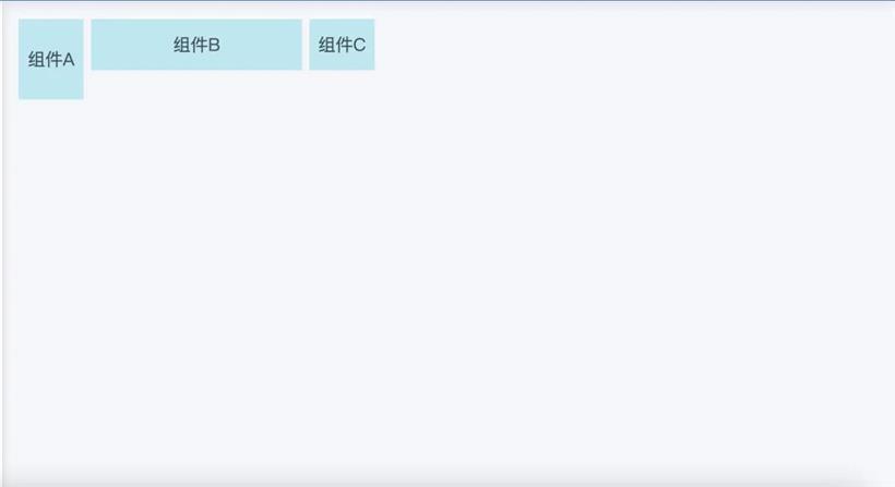
const MyGrid = () => {
  // 堆代码 duidaima.com
  // 定义断点
  const breakpoints = { lg: 1200, md: 996, sm: 768, xs: 480 };
  // 定义断点对应的列数
  const cols = { lg: 12, md: 10, sm: 6, xs: 4 };

  // 定义不同断点下的布局
  const layouts = {
    lg: [
      { i: 'a', x: 0, y: 0, w: 6, h: 3 },
      { i: 'b', x: 6, y: 0, w: 6, h: 3 },
    ],
    md: [
      { i: 'a', x: 0, y: 0, w: 5, h: 3 },
      { i: 'b', x: 5, y: 0, w: 5, h: 3 },
    ],
    sm: [
      { i: 'a', x: 0, y: 0, w: 6, h: 3 },
      { i: 'b', x: 0, y: 3, w: 6, h: 3 },
    ],
    xs: [
      { i: 'a', x: 0, y: 0, w: 4, h: 3 },
      { i: 'b', x: 0, y: 3, w: 4, h: 3 },
    ],
  };

  return (
    <ResponsiveReactGridLayout
      className="layout"
      breakpoints={breakpoints}
      cols={cols}
      layouts={layouts}
    >
      <div key="a">Component A</div>
      <div key="b">Component B</div>
    </ResponsiveReactGridLayout>
  );
};
断点布局实现的关键是获取并监听屏幕宽度的变化,这里使用了 resize-observer-polyfill 组件库,可以兼容旧浏览器实现元素大小的变化。首先我们创建一个 ResizeObserver 实例,在回调函数中获取目标元素的宽度,并通过 setState 更新。下面是获取屏幕宽度的主要代码:import ResizeObserver from 'resize-observer-polyfill';// 引入resize-observer-polyfill
this.resizeObserver = new ResizeObserver((entries) => {
const node = this.elementRef.current // 获取当前元素节点
if (node instanceof HTMLElement) {
// 通过 resize-observer-polyfill 中的 api 获取当前元素的宽度
const width = entries[0].contentRect.width
this.setState({width})
}
})
现在我们知道了如何获取元素的宽度,当我们缩放视图窗口时,需要判断目前视图窗口的宽度处于哪个断点范围内,这时候我们用到的方法是 onWidthChange,该方法会监听每一次宽度变化,根据新的窗口宽度和断点信息,重新计算网格布局,并更新组件状态。其中 getBreakpointFromWidth 方法根据当前屏幕宽度,返回设置的断点。getColsFromBreakpoint 方法根据断点,返回当前的布局。下面的核心代码实现:// 判断断点是否变化
if (
lastBreakpoint !== newBreakpoint ||
prevProps.breakpoints !== breakpoints ||
prevProps.cols !== cols
) {
// 如果下一个布局中没有当前断点,则保留当前布局
if (!(lastBreakpoint in newLayouts))
newLayouts[lastBreakpoint] = cloneLayout(this.state.layout);
// 根据现有布局和新的断点查找或生成布局
let layout = findOrGenerateResponsiveLayout(
newLayouts,
breakpoints,
newBreakpoint,
lastBreakpoint,
newCols,
compactType
);
// 根据子元素和初始布局生成新的布局
layout = synchronizeLayoutWithChildren(
layout,
this.props.children,
newCols,
compactType,
this.props.allowOverlap
);
// 存储新布局。
newLayouts[newBreakpoint] = layout;
this.setState({
breakpoint: newBreakpoint,
layout: layout,
cols: newCols
}); // 存入当前新的断点数据
}
插入:这里我们是使用了 resize-observer-polyfill 组件库中的 api 来监听屏幕宽高变化,我们还可以使用 css 中的 @media 来实现宽高变化带来的样式改变。另外还有 js 的原生方法 window.innerWidth 获取屏幕的宽高并通过 window.addEventListener 监听宽度的变化。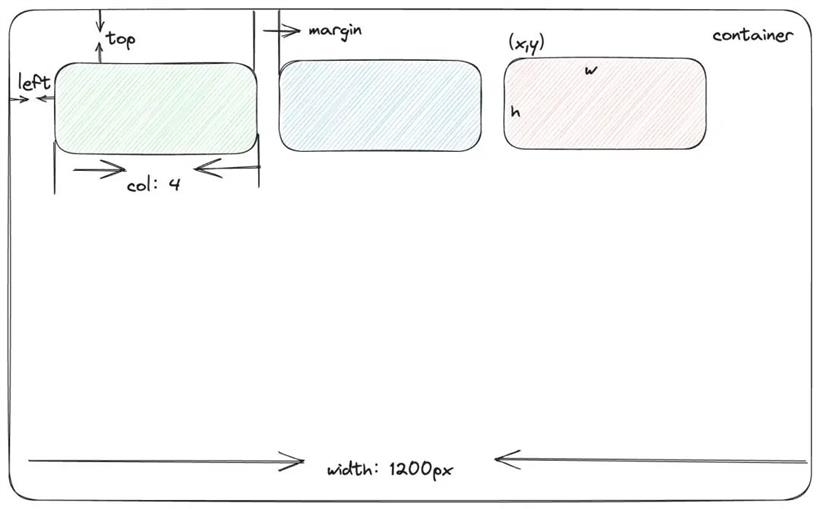
render(): ReactNode {
  const {
    x,
    y,
    w,
    h,
    isDraggable,
    isResizable,
    droppingPosition,
    useCSSTransforms
  } = this.props;

  // 定位
  const pos = calcGridItemPosition(
    this.getPositionParams(),
    x,
    y,
    w,
    h,
    this.state
  );
  const child = React.Children.only(this.props.children);

  // 创建子元素。我们克隆现有的元素,但修改它的className和样式。
  let newChild = React.cloneElement(child, {
    ref: this.elementRef,
    className: clsx(
      "react-grid-item",
      child.props.className,
      this.props.className,
      {
        static: this.props.static,
        resizing: Boolean(this.state.resizing),
        "react-draggable": isDraggable,
        "react-draggable-dragging": Boolean(this.state.dragging),
        dropping: Boolean(droppingPosition),
        cssTransforms: useCSSTransforms
      }
    ),
    // 我们可以设置子元素的宽度和高度,但我们不能设置位置。
    style: {
      ...this.props.style,
      ...child.props.style,
      ...this.createStyle(pos)
    }
  });

  // 绑定缩放事件
  newChild = this.mixinResizable(newChild, pos, isResizable);

  // 绑定拖拽事件
  newChild = this.mixinDraggable(newChild, isDraggable);

  return newChild;
}
子组件渲染export function calcGridItemPosition() {
const { margin, containerPadding, rowHeight } = positionParams;
const colWidth = calcGridColWidth(positionParams);
const out = {};
// 缩放态计算宽高
if (state && state.resizing) {
out.width = Math.round(state.resizing.width);
out.height = Math.round(state.resizing.height);
}
// 否则,按网格单位计算。
else {
out.width = calcGridItemWHPx(w, colWidth, margin[0]);
out.height = calcGridItemWHPx(h, rowHeight, margin[1]);
}
// 拖动态计算top、left
if (state && state.dragging) {
out.top = Math.round(state.dragging.top);
out.left = Math.round(state.dragging.left);
}
// 否则,按网格单位计算。
else {
out.top = Math.round((rowHeight + margin[1]) * y + containerPadding[1]);
out.left = Math.round((colWidth + margin[0]) * x + containerPadding[0]);
}
return out;
}
在上面的代码中,我们看到在网格单位计算中用到了 calcGridColWidth、calcGridItemWHPx 方法, calcGridColWidth 用于计算每一列的宽度,calcGridItemWHPx 用于计算整个网络布局的宽高。下面分别详细介绍: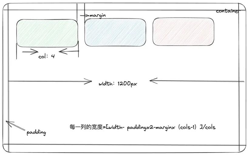
export function calcGridColWidth(positionParams: PositionParams): number {
  const { margin, containerPadding, containerWidth, cols } = positionParams;
  return (
    (containerWidth - margin[0] * (cols - 1) - containerPadding[0] * 2) / cols
  );
}
计算网格项目宽高export function calcGridItemWHPx(
// 子组件 child 的宽或高 w/h
gridUnits: number,
// 每个网格单位在像素上实际的大小,也就是上面 calcGridColWidth 计算的每一列宽度
colOrRowSize: number,
// 子组件 child 之间的间距
marginPx: number
): number {
// 0 * Infinity === NaN, which causes problems with resize contraints
if (!Number.isFinite(gridUnits)) return gridUnits;
return Math.round(
colOrRowSize * gridUnits + Math.max(0, gridUnits - 1) * marginPx
);
}
合并样式const child = React.Children.only(this.props.children);
// 通过克隆现有的元素创建为新的子元素,并修改它的 className 和样式。
let newChild = React.cloneElement(child, {
ref: this.elementRef,
className: clsx(
"react-grid-item",
child.props.className,
this.props.className,
{
static: this.props.static,
resizing: Boolean(this.state.resizing),
"react-draggable": isDraggable,
"react-draggable-dragging": Boolean(this.state.dragging),
dropping: Boolean(droppingPosition),
cssTransforms: useCSSTransforms
}
),
// 我们可以设置子元素的宽度和高度
style: {
...this.props.style,
...child.props.style,
...this.createStyle(pos)
}
});
// 绑定缩放功能。默认是可缩放,用户也可设置为不可缩放
newChild = this.mixinResizable(newChild, pos, isResizable);
// 绑定拖拽功能。默认是可拖拽,用户也可设置为不可拖拽
newChild = this.mixinDraggable(newChild, isDraggable);
在上面这段代码中,我们克隆后的新元素都调用 mixinResizable、mixinDraggable 方法,分别用来执行可缩放和拖拽功能的。下面具体讲讲如何实现mixinDraggable(
child: ReactElement<any>,
isDraggable: boolean
): ReactElement<any> {
return (
<DraggableCore
disabled={!isDraggable} // 是否支持拖拽
onStart={this.onDragStart} // 开始拖拽触发的事件
onDrag={this.onDrag} // 拖拽过程中一直触发的事件
onStop={this.onDragStop} // 拖拽结束时触发的事件
handle={this.props.handle} // 上一级组件传入的回调函数
cancel={
".react-resizable-handle" +
(this.props.cancel ? "," + this.props.cancel : "")
}
scale={this.props.transformScale}
nodeRef={this.elementRef}
>
{child}
</DraggableCore>
);
}
3.获取以上两种元素的定位信息
onDragStart: (Event, ReactDraggableCallbackData) => void = (e, { node }) => {
  const { onDragStart, transformScale } = this.props;
  if (!onDragStart) return;

  const newPosition: PartialPosition = { top: 0, left: 0 };

  // offsetParent: 获取指定元素的最近的祖先元素中含有定位属性(position 不为 static)的元素。
  const { offsetParent } = node;
  if (!offsetParent) return;

  // getBoundingClientRect: 获取指定元素的大小和位置信息
  const parentRect = offsetParent.getBoundingClientRect();
  const clientRect = node.getBoundingClientRect();
  const cLeft = clientRect.left / transformScale;
  const pLeft = parentRect.left / transformScale;
  const cTop = clientRect.top / transformScale;
  const pTop = parentRect.top / transformScale;
  newPosition.left = cLeft - pLeft + offsetParent.scrollLeft;
  newPosition.top = cTop - pTop + offsetParent.scrollTop;
  this.setState({ dragging: newPosition }); // 当前拖拽元素最新定位信息

  const { x, y } = calcXY(
    this.getPositionParams(),
    newPosition.top,
    newPosition.left,
    this.props.w,
    this.props.h
  );

  return onDragStart.call(this, this.props.i, x, y, {
    e,
    node,
    newPosition
  });
};
onDrag - 拖拽中onDrag = () => {
...
const positionParams = this.getPositionParams();
// 边界计算; 保证项目在网格保持在网格内
if (isBounded) {
const { offsetParent } = node;
if (offsetParent) {
const { margin, rowHeight } = this.props;
const bottomBoundary =
offsetParent.clientHeight - calcGridItemWHPx(h, rowHeight, margin[1]);
// 将 top 的值设置在 0 到 bottomBoundary 之间
top = clamp(top, 0, bottomBoundary);
const colWidth = calcGridColWidth(positionParams);
const rightBoundary =
containerWidth - calcGridItemWHPx(w, colWidth, margin[0]);
left = clamp(left, 0, rightBoundary);
}
}
...
}
// utils.js
export function clamp(
num: number,
lowerBound: number,
upperBound: number
): number {
return Math.max(Math.min(num, upperBound), lowerBound);
}
onDragStop - 拖拽结束onDragStop: (Event, ReactDraggableCallbackData) => void = (e, { node }) => {
...
const newPosition: PartialPosition = { top, left };
this.setState({ dragging: null }); // 表示拖拽结束
const { x, y } = calcXY(this.getPositionParams(), top, left, w, h);
return onDragStop.call(this, i, x, y, {
e,
node,
newPosition
});
};
拖拽过程中的阴影是如何实现?
.droppable-element {

  ...

  background: #fdd;
}
此外我们回顾一下上面子组件渲染的时候,有一个合并样式,其中合并 className 里有一项是:"react-draggable-dragging": Boolean(this.state.dragging)
// .css
.react-grid-item.react-draggable-dragging {
transition: none; // 取消了被拖拽元素上的过渡效果。RGL 默认会添加过渡动画效果来实现平滑的移动效果
z-index: 3; // 保证拖拽元素在顶部,不被其他元素覆盖
will-change: transform; // 提示浏览器被拖拽元素将要发生的变化,可以优化动画性能
}
3.4 缩放功能实现mixinResizable() {
const positionParams = this.getPositionParams();
// 计算最大宽度,不能超过窗口的宽度
const maxWidth = calcGridItemPosition(
positionParams,
0,
0,
cols - x,
0
).width;
// 约束最大最小的宽度
const mins = calcGridItemPosition(positionParams, 0, 0, minW, minH);
const maxes = calcGridItemPosition(positionParams, 0, 0, maxW, maxH);
// 计算可以缩放的最小宽高
const minConstraints = [mins.width, mins.height];
// 计算可以缩放的最大宽高
const maxConstraints = [
Math.min(maxes.width, maxWidth),
Math.min(maxes.height, Infinity)
];
return (
<Resizable
// 是否可缩放
draggableOpts={{
disabled: !isResizable
}}
className={isResizable ? undefined : "react-resizable-hide"}
width={position.width}
height={position.height}
minConstraints={minConstraints}
maxConstraints={maxConstraints}
onResizeStop={this.onResizeStop}
onResizeStart={this.onResizeStart}
onResize={this.onResize}
transformScale={transformScale}
resizeHandles={resizeHandles}
handle={resizeHandle}
>
{child}
</Resizable>
);
}
从上面的代码中我们还看到在 Resizable 组件中调用了一些拖拽事件例如:onResizeStart、onResizeStop、onResize 分别用于处理调整大小开始时、结束时、过程中触发的事件。都共同调用了 onResizeHandler 方法,下面我们来看下 onResizeHandler 函数:onResizeHandler() {
const handler = this.props[handlerName];
if (!handler) return;
const { cols, x, y, i, maxH, minH } = this.props;
let { minW, maxW } = this.props;
// 得到新的XY,给定像素值中的高度和宽度,计算网格单位。
let { w, h } = calcWH(
this.getPositionParams(),
size.width,
size.height,
x,
y
);
// 堆代码 duidaima.com
// minW应该至少是1 (TODO propTypes验证?)
minW = Math.max(minW, 1);
// maxW应该最多为(cols - x)
maxW = Math.min(maxW, cols - x);
// 最小/最大限制
w = clamp(w, minW, maxW);
h = clamp(h, minH, maxH);
this.setState({ resizing: handlerName === "onResizeStop" ? null : size });
handler.call(this, i, w, h, { e, node, size });
}