
- 联系我们
- duidaima.com 版权声明
- 闽ICP备2020021581号
-
 闽公网安备 35020302035485号
闽公网安备 35020302035485号


让UI设计师弄一个中间透明的png图片是一种解决方案,但相比之下纯CSS实现的关闭图标占用流量更少、加载速度快、且方便修改图标的颜色。本文给出纯CSS实现中间透明的关闭图标的简单示例。
<style>
    .origin {
        width: 320px;
        height: 240px;
        background-size: cover;
        background-image: url("https://5b0988e595225.cdn.sohucs.com/images/20171010/2ab85e31fee24a36b3e9bb79d71885b2.jpeg");
    }
</style>
<div class="origin">
</div>
效果如下:
<style>
    .origin {
        width: 320px;
        height: 240px;
        background-size: cover;
        background-image: url("https://5b0988e595225.cdn.sohucs.com/images/20171010/2ab85e31fee24a36b3e9bb79d71885b2.jpeg");
    }
    .line {
        stroke: #888;
        stroke-width: 17;
    }
</style>
<div class="origin">
    <svg xmlns="https://www.w3.org/2000/svg" viewBox="0 0 100 100">
        <line class="line" x1="0" y1="0" x2="100" y2="100" />
        <line class="line" x1="0" y1="100" x2="100" y2="0" />
    </svg>
</div>
展示效果为: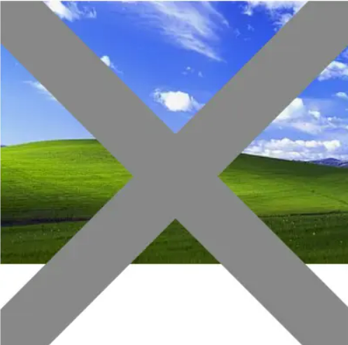
<style>
    .origin {
        width: 320px;
        height: 240px;
        background-size: cover;
        background-image: url("https://5b0988e595225.cdn.sohucs.com/images/20171010/2ab85e31fee24a36b3e9bb79d71885b2.jpeg");
    }
    .close {
        display: block;
        background-color: #fff;
        padding: 0.75rem;
        width: 2rem;
        border-radius: 50%;
    }
    .line {
        stroke: #888;
        stroke-width: 17;
    }
</style>
<div class="origin">
    <a class="close" href="javascript:void(0)">
        <svg xmlns="https://www.w3.org/2000/svg" viewBox="0 0 100 100">
            <line class="line" x1="0" y1="0" x2="100" y2="100" />
            <line class="line" x1="0" y1="100" x2="100" y2="0" />
        </svg>
    </a>
</div>
为了方便对比,这里特意地将图标做得大一些,当然在实际应用中一般不做那么大。展示效果如下:
<style>
    .origin {
        width: 320px;
        height: 240px;
        background-size: cover;
        background-image: url("https://5b0988e595225.cdn.sohucs.com/images/20171010/2ab85e31fee24a36b3e9bb79d71885b2.jpeg");
    }
    .close {
        mix-blend-mode: hard-light;
        display: block;
        background-color: #fff;
        padding: 0.75rem;
        width: 2rem;
        border-radius: 50%;
    }
    .line {
        stroke: #888;
        stroke-width: 17;
    }
</style>
<div class="origin">
    <a class="close" href="javascript:void(0)">
        <svg xmlns="https://www.w3.org/2000/svg" viewBox="0 0 100 100">
            <line class="line" x1="0" y1="0" x2="100" y2="100" />
            <line class="line" x1="0" y1="100" x2="100" y2="0" />
        </svg>
    </a>
</div>
运行效果为:
<style>
    .origin {
        width: 320px;
        height: 240px;
        background-size: cover;
        background-image: url("https://5b0988e595225.cdn.sohucs.com/images/20171010/2ab85e31fee24a36b3e9bb79d71885b2.jpeg");
    }
    .close {
        float: right;
        mix-blend-mode: hard-light;
        display: block;
        background-color: #fff;
        padding: 0.75rem;
        width: 2rem;
        border-radius: 50%;
    }
    .close svg {
        border-radius: 0.15rem;
    }
    .line {
        stroke: #888;
        stroke-width: 17;
    }
</style>
<div class="origin">
    <a class="close" href="javascript:void(0)">
        <svg xmlns="https://www.w3.org/2000/svg" viewBox="0 0 100 100">
            <line class="line" x1="0" y1="0" x2="100" y2="100" />
            <line class="line" x1="0" y1="100" x2="100" y2="0" />
        </svg>
    </a>
</div>
展示效果如下: