
- 联系我们
- duidaima.com 版权声明
- 闽ICP备2020021581号
-
 闽公网安备 35020302035485号
闽公网安备 35020302035485号

(1)ElementUI
.text {
  color: var(--c-color)
}
这样就可以一劳永逸——直接支持两套或者多套主题模式。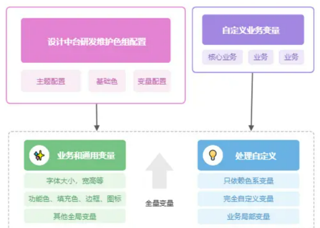
(2)对于各个前端团队来说,可以通过主题色,色系基础色,任意自定义和配置 自己业务需要颜色的变量
 // 测试新主题 堆代码www.duidaima.com
  let varList = {
    ...colorColor
  }
  let tPrimaryList = themePrimaryList
  initThemes('', tPrimaryList, varList, '')
(2)切换该主题色甚至该业务下的变量对应的值,通过css-vars-ponyfill,把自定义常量打到对应的DOM节点(通常是html或者body下),从而实现切换主题import cssVars from "css-vars-ponyfill";
import { themeTypeList, themePrimaryList } from "./themeList.js";
import { mix, hex2rgb } from "./com/util";
/**
* 堆代码 www.duidaima.com
* initThemes 全局初始化 主题
* @param theme 主题 [必填]
* @param tPrimaryList 主题列表[必填] array ['theme1','theme2']
* @param valList 自定义主题列表 {val1:['theme1-color','theme2-color']} ....
* @param themeType 主题类型 -深浅 ....
* @param changeType 区分改的是主题类型,还是主题色 [ 预留字段 ]....
* @returns {boolean}
*/
export const initThemes = (theme, tPrimaryList, varList, themeType) => {
let variables = getVariables(
theme || "lightBlue",
tPrimaryList,
varList,
themeType
);
cssVars({
watch: true, // 当添加,删除或修改其或元素的禁用或href属性时,ponyfill将自行调用
variables: variables, // variables 自定义属性名/值对的集合
onlyLegacy: false, // false 默认将css变量编译为浏览器识别的css样式 true 当浏览器不支持css变量的时候将css变量编译为识别的css
});
};
themeList.js 这里存放一些假设我们在应用端设置的一些主题和色系(深浅)基础色import { light } from './com/light'
import { dark } from './com/dark'
// 堆代码 www.duidaima.com
// 主题 - 主题色
export const themePrimaryList = {
dark: [
{
color: '#FFAA0E',
name: '深黄',
theme: 'darkYellow'
},
{
color: '#FFAA0E',
name: '深蓝',
theme: 'darkBlue'
},
],
light: [
{
color: '#FFAA0E',
name: '深黄',
theme: 'lightYellow'
},
{
color: '#256DFF',
name: '浅蓝',
theme: 'lightBlue'
}
]
}
export const themeTypeList = {
dark: dark,
light: light,
}
【3】色组 & 色值平台设计 // 功能色
"--c-primary": color.C00, // 主题色
"--c-primary-rgb": hex2rgb(color.C00), // 主题色RGB
"--c-primary-hover": mix(white, color.C00, 12),
"--c-primary-active": mix(black, color.C00, 12),
"--c-fill-primary": mix(white, color.C00, 88), //主题色文字的背景填充色
"--c-border-primary": mix(white, color.C00, 80), //主题色文字的边框色
"--c-primary-mix-1": mix(white, color.C00, 10),
"--c-primary-mix-2": mix(white, color.C00, 20),
"--c-primary-mix-3": mix(white, color.C00, 30),
"--c-primary-mix-4": mix(white, color.C00, 40),
"--c-primary-mix-5": mix(white, color.C00, 50),
"--c-primary-mix-6": mix(white, color.C00, 60),
"--c-primary-mix-7": mix(white, color.C00, 70),
"--c-primary-mix-8": mix(white, color.C00, 80),
"--c-primary-mix-9": mix(white, color.C00, 90),
"--c-success": color.C01, // 成功色
"--c-warning": color.C01, // 警告色
"--c-error": color.C01, // 错误色
"--c-green": color.C06, // 语义绿 跌
"--c-green-rgb": hex2rgb(color.C06),
"--c-green-hover": mix(white, color.C06, 12),
"--c-green-active": mix(black, color.C06, 12),
"--c-red": color.C08, // 语义红 涨
"--c-red-rgb": hex2rgb(color.C08),
"--c-red-hover": mix(white, color.C08, 12),
"--c-red-active": mix(black, color.C08, 12),
"--c-yellow": color.C07, // 语义黄
"--c-yellow-rgb": hex2rgb(color.C07),
"--c-yellow-hover": mix(white, color.C07, 12),
"--c-yellow-active": mix(black, color.C07, 12),
// 堆代码 www.duidaima.com
// 文字色
"--c-text": color.C02, // 一般文本
"--c-text-title": color.C02, // 标题
"--c-text-subtitle": hex2rgb(color.C02, 0.65), // 次要 - 副标题
"--c-text-info": hex2rgb(color.C02, 0.45), // 提示
"--c-text-placeholder": color.C02, // 占位文本色
"--c-text-link": color.C01, // 链接文本色
"--c-text-disable": hex2rgb(color.C02, 0.3), // 禁止或失效
// 填充色
"--c-fill": color.C04, // 组件默认背景颜色
"--c-fill-body": color.C11, // 页面背景
"--c-fill-shadow": hex2rgb(color.C11, 0.1), // 阴影
"--c-fill-zebra": color.C05, // 斑马线色
"--c-fill-mask": color.C11, // 遮罩背景
"--c-fill-disable": hex2rgb(color.C02, 0.07), // 禁止
"--c-fill-scroll": hex2rgb(color.C02, 0.5), // 滚动条色
"--c-fill-scroll-hover": mix(white, color.C02, 12),
"--c-fill-scroll-active": mix(black, color.C02, 12),
// 边框/分割线颜色
"--c-border": color.C01, // 基本边框色
"--c-border-line": hex2rgb(color.C02, 0.07), // 分割线
"--c-border-light": hex2rgb(color.C02, 0.12), // 浅边框色 (小边框)
"--c-border-lighter": hex2rgb(color.C02, 0.07), // 更浅色
"--c-border-disable": hex2rgb(color.C02, 0.04), // 禁用边框
// 图标色
"--c-icon": hex2rgb(color.C02, 0.65),
"--c-icon-hover": color.C09,
"--c-icon-active": color.C01,
"--c-icon-down": color.C10,
// 标签色
// ...getTabColor(color),
// 业务自定义- 写在业务方变量
//由主题切换的时候,动态传入入的 自定义变量列表 varList
...getBusinessVars(theme, type, varList, tPrimaryList),
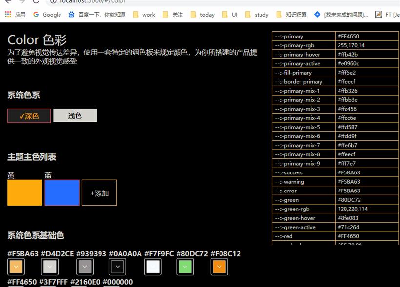
使用的时候只需要熟悉这些语义化的常量即可,当然我们也设计了一个可视化页面,可以看到全量的自定义变量,对应的颜色,这样更为方便全局查看。当然至于上面的混合代码,可能各位看着有些奇怪,这是我们这边UED同学为了减少颜色设计了一套颜色规范(例如 悬浮色,根据8.8成默认色和1.2成白色混合计算得出;按下色根据8.8成默认色和1.2成黑色混合计算得出 ),例如混合Mix函数(颜色混合 规则符合 scss - mix),剩余的就是RGB和十六进制颜色互相转换 这类的函数--color-codercao-fill01 :['dark.C01','dark.C02','light.C03','#fff'](2)只和深浅相关自定义常量多态,只和深浅基础色有关的颜色
    // 主题变量color.vue
    // (1)完全自定义常量多态,一种主题色对应一种颜色
    "--color-codercao-test0": mergeColor(
      ["#444", "#666"],
      ["#444", "#666"],
      type,
      theme,
      tPrimaryList
    ),
    // (2)只和深浅相关自定义常量多态,只和深浅基础色有关的颜色
    "--color-codercao-test1": mergeColor([dark.C01], [light.C02], type),
我们就需要根据主题切换的时候,动态去计算,于是我们就要设计一个计算颜色的方法,它拿到各个主题下的颜色,主题,主题列表,甚至主题类型去计算在当前主题下这个变量的颜色具体用哪个颜色/**
* 堆代码 www.duidaima.com
* mergeColor 获取在当前主题下该变量(自定义)的颜色
* @param darkList [必填] 自定义常量在不同主题下的 深色系颜色列表 array ['theme1','theme2']
* @param lightList [必填] 自定义常量在不同主题下的 浅色系颜色列表 array ['theme1','theme2']
* @param type 主题类型 深 - 浅
* @param theme 主题色-名
* @param tPrimaryList 主题列表
* @returns {boolean}
*/
const mergeColor = (darkList, lightList, type, theme, tPrimaryList) => {
let colorList = type == "dark" ? darkList : lightList;
let color = colorList[0],
index = 0;
// 如果 type 有值说明 该自定义主题常量,只和深浅基础色 (两种)有关
if (!theme) {
color = type == "dark" ? darkList[0] : lightList[0];
} else {
// 否则认为是 一种主题 一种色值
index = getThemeIndex(theme, tPrimaryList);
color = colorList[index];
}
return color;
};
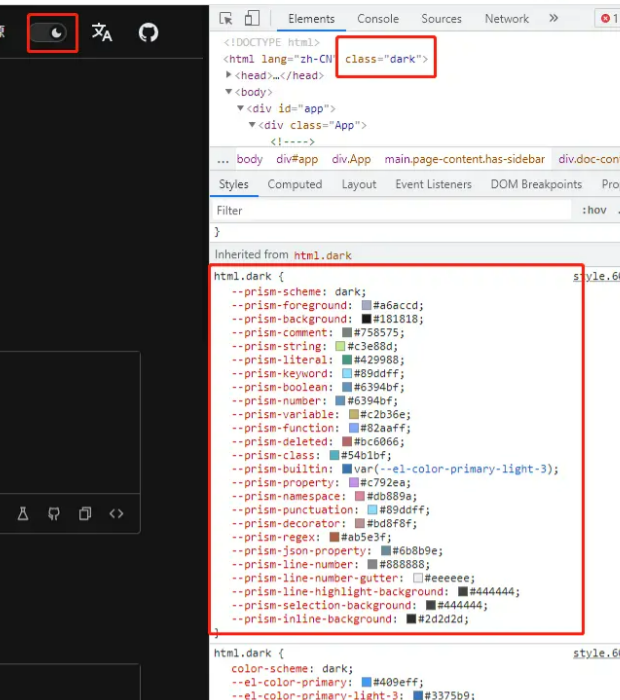
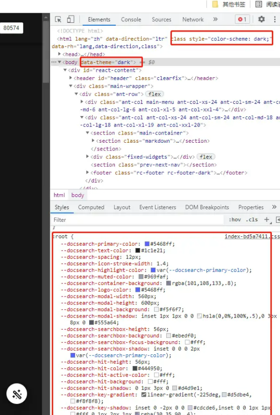
另外还有一种极端情况,是可以把css变量自定义打在对应的DOM上。