

- 联系我们
- duidaima.com 版权声明
- 闽ICP备2020021581号
-
 闽公网安备 35020302035485号
闽公网安备 35020302035485号

简易迁移:BootstrapVue使开发人员能够轻松从原生JavaScript切换到Vue.js,而无需担心Bootstrap对JQuery的重度依赖。
官网地址:https://bootstrap-vue.org/
vue create my-project注意:BootstrapVue目前不支持Vue.js 3的稳定版本。您需要将其与vue2-3迁移构建集成以使其正常工作。然而,由于该方法存在已知限制,不建议这样做。不过,您可以按照这里的步骤使用vue2-3迁移构建来创建一个新的应用程序。
# With npm
npm install bootstrap bootstrap-vue

# With yarn
yarn add bootstrap bootstrap-vue
使用CDN
<!-- Add Bootstrap and Bootstrap-Vue CSS in the <head> section -->
<link
 rel="stylesheet"
 href="https://unpkg.com/bootstrap/dist/css/bootstrap.min.css"
/>
<link
 rel="stylesheet"
 href="https://unpkg.com/bootstrap-vue/dist/bootstrap-vue.min.css"
/>

<!-- Add Vue and BootstrapVue scripts just before the closing </body> tag -->
<script src="https://unpkg.com/vue@2.6.14/dist/vue.min.js"></script>
<script src="https://unpkg.com/bootstrap-vue@2.21.2/dist/bootstrap-vue.min.js"></script>
以上代码将把每个包的最小化和最新版本拉入我们的项目中,干净简洁!对于本文,我们将一直使用软件包管理器。让我们继续设置已安装的BootstrapVue软件包。
import Vue from 'vue'
// 堆代码 duidaima.com
// Import BootstrapVue
import { BootstrapVue } from 'bootstrap-vue'

// Import Bootstrap and BootstrapVue CSS files ( ensure to follow the order)
import 'bootstrap/dist/css/bootstrap.css'
import 'bootstrap-vue/dist/bootstrap-vue.css'

// Make BootstrapVue available throughout your project
Vue.use(BootstrapVue)
在上面的代码中,我们使用 Vue.use() 函数在应用程序的入口点注册了BootstrapVue,以便我们的应用程序可以识别它。<template>
<div class="m-5 d-flex justify-content-center">
-<b-button variant="primary">Click me!</b-button>
</div>
</template>;
上面的代码将创建一个带有文本“点击我!”的主色按钮,因为 variant 属性设置为 primary 。您可以通过指定其他变体值(例如 danger 或 success )来更改按钮的颜色和样式。
<template>
  <div class="m-5">
    <b-form @submit="onSubmit" @reset="onReset" v-if="show">
      <b-form-group
        id="input-group-1"
        label="Email address:"
        label-for="input-1"
        description="We'll never share your email with anyone else."
      >
        <b-form-input
          id="input-1"
          v-model="form.email"
          type="email"
          placeholder="Enter email"
          required
        ></b-form-input>
      </b-form-group>

      <b-form-group id="input-group-2" label="Your Name:" label-for="input-2">
        <b-form-input
          id="input-2"
          v-model="form.name"
          placeholder="Enter name"
          required
        ></b-form-input>
      </b-form-group>

      <b-form-group id="input-group-3" label="Food:" label-for="input-3">
        <b-form-select
          id="input-3"
          v-model="form.food"
          :options="foods"
          required
        ></b-form-select>
      </b-form-group>

      <b-form-group id="input-group-4" v-slot="{ ariaDescribedby }">
        <b-form-checkbox-group
          v-model="form.checked"
          id="checkboxes-4"
          :aria-describedby="ariaDescribedby"
        >
          <b-form-checkbox value="me">Check me out</b-form-checkbox>
          <b-form-checkbox value="that">Check that out</b-form-checkbox>
        </b-form-checkbox-group>
      </b-form-group>

      <b-button type="submit" variant="primary">Submit</b-button>
      <b-button type="reset" variant="danger">Reset</b-button>
    </b-form>
  </div>
</template>

<script>
export default {
  data() {
    return {
      form: {
        email: "",
        name: "",
        food: null,
        checked: [],
      },
      foods: [
        { text: "Select One", value: null },
        "Carrots",
        "Beans",
        "Tomatoes",
        "Corn",
      ],
      show: true,
    };
  },
  methods: {
    onSubmit(event) {
      event.preventDefault();
      alert(JSON.stringify(this.form));
    },
    onReset(event) {
      event.preventDefault();
      // Reset our form values
      this.form.email = "";
      this.form.name = "";
      this.form.food = null;
      this.form.checked = [];
      // Trick to reset/clear native browser form validation state
      this.show = false;
      this.$nextTick(() => {
        this.show = true;
      });
    },
  },
};
</script>
上面的代码将创建一个简单的表单,请求用户的电子邮件、姓名和食品选择。我们可以根据需要随时自定义此表单。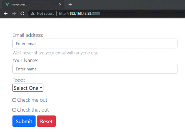
<template>
  <div class="m-5 d-flex justify-content-center">
    <b-card
      title="Card Title"
      img-src="https://images.unsplash.com/photo-1653387137517-fbc54d488ed8?ixlib=rb-4.0.3&ixid=MnwxMjA3fDB8MHxzZWFyY2h8MjB8fHZ1ZXxlbnwwfHwwfHw%3D&auto=format&fit=crop&w=500&q=60"
      img-alt="Image"
      img-top
      tag="article"
      style="max-width: 20rem"
      class="mb-2"
    >
      <b-card-text>
        You can add some text in your card to suit your use case
      </b-card-text>
      <b-button href="#" variant="primary">Go somewhere</b-button>
    </b-card>
  </div>
</template>
上面的代码将使用 b-card 组件创建一个带有图像、标题和一些文本的卡片组件。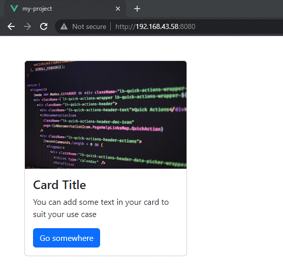
<template>
  <div
    class="d-flex justify-content-center align-items-center"
    style="height: 100vh"
  >
    <b-button variant="primary" @click="showModal = true">Open Modal</b-button>
    <b-modal v-model="showModal" title="My Modal">
      <p>Hello, world!</p>
    </b-modal>
  </div>
</template>
<script>
export default {
  data() {
    return {
      showModal: false,
    };
  },
};
</script>
上面的代码将创建一个按钮,当点击时,将显示一个带有标题“我的模态框”和文本“你好,世界!”的模态对话框。
<template>
  <div
    class="d-flex justify-content-center align-items-center"
    style="height: 100vh"
  >
    <b-carousel
      id="carousel-1"
      v-model="slide"
      :interval="4000"
      controls
      indicators
      background="#ababab"
      img-width="1024"
      img-height="480"
      style="text-shadow: 1px 1px 2px #333"
      @sliding-start="onSlideStart"
      @sliding-end="onSlideEnd"
      class="w-75"
    >
      <!-- Text slides with image -->
      <b-carousel-slide
        caption="Our First slide"
        text="A beautiful day in the streets"
        img-src="https://picsum.photos/1024/480/?image=57"
      ></b-carousel-slide>
      <!-- Slides with custom text -->
      <b-carousel-slide img-src="https://picsum.photos/1024/480/?image=62">
        <h1>Welcome to BootstrapVue</h1>
      </b-carousel-slide>
      <!-- Slides with just an image -->
      <b-carousel-slide
        text="my text"
        img-src="https://picsum.photos/1024/480/?image=64"
      ></b-carousel-slide>
      <!-- Slides with img slot -->
      <!-- Note the classes .d-block and .img-fluid to prevent browser default image alignment -->
      <b-carousel-slide>
        <template #img>
          <img
            class="d-block img-fluid w-100"
            width="1024"
            height="480"
            src="https://picsum.photos/1024/480/?image=50"
            alt="image slot"
          />
        </template>
      </b-carousel-slide>
    </b-carousel>
  </div>
</template>
这段代码将创建一个轮播,其中包含三个幻灯片,每个幻灯片都包含一张图片和一个标题。BootstrapVue还提供了其他与轮播相关的组件,可以用于创建幻灯片转换、淡入淡出转换,并提供事件,可以在每个幻灯片显示之前和之后触发操作。
<template>
  <div
    class="d-flex justify-content-center align-items-center"
    style="height: 100vh"
  >
    <b-button variant="primary" v-b-tooltip.hover.top="'Hello, world!'"
      >Hover me!</b-button
    >
  </div>
</template>
这段代码将创建一个按钮,当鼠标悬停在上面时,将显示一个带有文本“Hello, world!”的工具提示。
<template>
  <div class="m-5">
    <b-button variant="primary" class="rounded-pill"
      >Primary Pill Button</b-button
    >
    <b-button variant="danger" class="rounded-0">Danger Square Button</b-button>
  </div>
</template>
这段代码将创建两个按钮,一个是主要颜色和圆形形状的按钮,另一个是危险颜色和方形形状的按钮。 rounded-pill 和 rounded-0 类是 BootstrapVue 类,用于控制按钮的边框半径。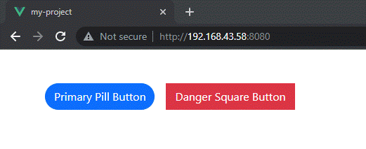
<template>
  <div class="m-5 d-flex justify-content-center">
    <b-button
      variant="success"
      class="my-custom-class"
      style="font-size: 1.2rem"
      >Customized Button</b-button
    >
  </div>
</template>
这段代码将创建一个带有自定义类 my-custom-class 和自定义样式 font-size: 1.2rem; 的成功按钮。
<template>
  <div
    class="d-flex justify-content-center align-items-center"
    style="height: 100vh"
  >
    <b-button variant="primary" @click="showModal = true">Open Modal</b-button>
    <b-modal v-model="showModal" title="My Modal" size="lg" centered>
      <p>Hello, world!</p>
    </b-modal>
  </div>
</template>
<script>
export default {
  data() {
    return {
      showModal: false,
    };
  },
};
</script>
点击后,此代码将创建一个按钮,该按钮将显示一个标题为“我的模态框”,文本为“你好,世界!”的模态对话框,具有较大的尺寸和居中位置。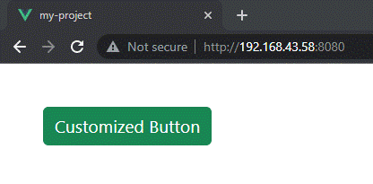
<template>
  <div class="d-flex justify-content-center m-5">
    <b-button variant="primary" @click="showModal = true">Open Modal</b-button>
    <b-modal v-model="showModal" title="My Modal">
      <template #default>
        <h2>Custom Heading</h2>
        <p>This is some custom content.</p>
      </template>
      <template #modal-footer="{ ok }">
        <b-button @click="ok()">Custom OK Button</b-button>
      </template>
      <template #modal-body="{ css }">
        <p :style="css">This paragraph has custom CSS.</p>
      </template>
    </b-modal>
  </div>
</template>
<script>
export default {
  data() {
    return {
      showModal: false,
    };
  },
};
</script>
这段代码将创建一个带有自定义标题和内容、确定按钮以及带有自定义 CSS 的段落的模态对话框。
<template>
  <div class="m-5">
    <b-button
      variant="primary"
      class="my-custom-class"
      style="background-color: red"
      >Custom Button</b-button
    >
  </div>
</template>
在上面的代码中,我们给按钮添加了一个自定义的类 my-custom-class 和一个自定义的样式 background-color: red 。这将把按钮的背景颜色改为红色。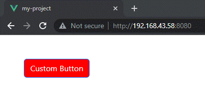
/* In your main.scss file */
@import "~bootstrap/scss/bootstrap";
@import "~bootstrap-vue/src/index.scss";
一旦导入预处理器文件,您可以使用它们的功能来为组件设置样式。例如,在Sass中,您可以使用变量来定义颜色和其他属性:
$primary-color: #007bff;

.custom-button {
  background-color: $primary-color;
  border-radius: 0.25rem;
}
在这个例子中,我们定义了一个变量来表示主要颜色,并使用它来为一个自定义类的按钮进行样式设置。这将使按钮具有一个背景颜色为 #007bff (即主要颜色)和一个边框半径为 0.25rem 的效果。<template>
<div class="m-5">
<b-button variant="primary" class="my-custom-class m-2"
>Custom Button</b-button
>
<b-button variant="primary">Custom Button</b-button>
<b-button variant="primary">Custom Button</b-button>
</div>
</template>
<style scoped>
.my-custom-class {
background-color: red;
}
</style>
在这个例子中,我们给 <style> 标签添加了 scoped 属性,并为 my-custom-class 类定义了样式。这个样式只会应用于这个组件中的按钮,而不会应用于页面上的其他按钮。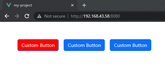
BootstrapVue是一个强大的工具,可以帮助开发人员快速、轻松地创建漂亮、响应式的Web应用程序。无论您是构建一个简单的网站还是一个复杂的Web应用程序,它都可以帮助您入门,并使构建用户界面变得更加容易。