
- 联系我们
- duidaima.com 版权声明
- 闽ICP备2020021581号
-
 闽公网安备 35020302035485号
闽公网安备 35020302035485号

当我们谈论或讨论在 Vue 中创建用户界面组件时,经常会提到可重用性。没错,Vue 的关键原则之一就是其基于组件的架构,这促进了可重用性和模块化。但这到底意味着什么呢?
3.如果需要拆分 "可重用组件",以便将拆分后的组件应用到其他地方,该怎么办?
4.协作:促进团队成员在 Vue 项目中的协作。它们提供了团队中每个人都能使用和理解的共享词汇和用户界面元素集。
3.管理组件依赖关系和状态:使用可重复使用的组件需要管理依赖关系,并确保每个组件保持自足和独立。组件不应紧密依赖外部资源或应用程序的状态管理系统。这样可以轻松集成到不同的项目中,减少冲突或意外副作用的可能性。
// 堆代码 duidaima.com
// Prototype.vue
<script setup lang="ts">
    import { defineProps, computed, Teleport, ref } from "vue";

    interface Props {
        firstName: string;
        lastName: string;
        image?: string;
    }

    const props = defineProps<Props>();
</script>

<template>
    <div class="app-card">
        <img
            class="user-image"
            :src="image"
            alt="avatar" />
        <div>
            <div>
                <label> {{ firstName }} {{ lastName }} </label>
            </div>
        </div>
    </div>
</template>

<style scoped>
    .app-card {
        padding-left: 10px;
        padding-right: 10px;
        padding-top: 5px;
        padding-bottom: 5px;
        background: white;
        box-shadow: 0 0 5px;
        border-radius: 5px;
        border: none;
        font-size: 1.5em;
        transition: 0.3s;
        display: flex;
        align-items: center;
    }
    .app-card label {
        font-weight: 600;
    }
    .app-card:hover {
        background: rgba(128, 128, 128, 0.5);
    }
    .user-image {
        width: 100px;
    }
</style>
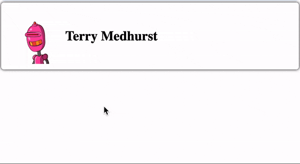
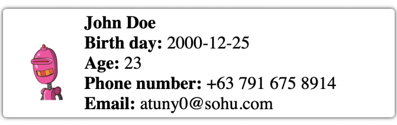
第 1 阶段
//Phase1.vue
<script setup lang="ts">
    import { defineProps, computed } from "vue";

    interface Props {
        firstName: string;
        lastName: string;
        image?: string;
        birthDay?: string;
        phone?: string;
        email?: string;
    }

    const props = defineProps<Props>();
    // 堆代码 duidaima.com
    const age = computed(() => {
        if (!props.birthDay) {
            return "0";
        }
        const birthYear = new Date(props.birthDay).getFullYear();
        const currentYear = new Date().getFullYear();
        return currentYear - birthYear;
    });
</script>

<template>
    <div
        ref="cardRef"
        class="app-card">
        <img
            class="user-image"
            :src="image"
            alt="avatar" />
        <div>
            <div>
                <label> {{ firstName }} {{ lastName }} </label>
            </div>
            <div>
                <div>
                    <label> Birth day: </label>
                    <span>
                        {{ birthDay }}
                    </span>
                </div>
                <div>
                    <label> Age: </label>
                    <span>
                        {{ age }}
                    </span>
                </div>
                <div>
                    <label> Phone number: </label>
                    <span>
                        {{ phone }}
                    </span>
                </div>
                <div>
                    <label> Email: </label>
                    <span>
                        {{ email }}
                    </span>
                </div>
            </div>
        </div>
    </div>
</template>

<style scoped>
    .app-card {
        padding-left: 10px;
        padding-right: 10px;
        padding-top: 5px;
        padding-bottom: 5px;
        background: white;
        box-shadow: 0 0 5px;
        border-radius: 5px;
        border: none;
        font-size: 1.5em;
        transition: 0.3s;
        display: flex;
        align-items: center;
    }
    .app-card label {
        font-weight: 600;
    }
    .app-card:hover {
        background: rgba(128, 128, 128, 0.5);
        color: black;
    }
    .user-image {
        width: 100px;
    }
</style>
此外,客户还希望添加员工名录页面,并以卡片格式显示用户资料。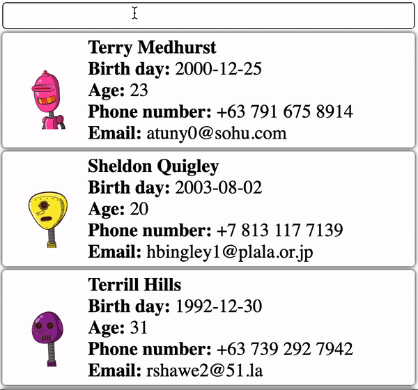
// SearchPage
<template>
    <div>
        <SearchInput v-model:value="searchValue" />
        <template
            :key="item.id"
            v-for="item of list">
            <div style="margin-bottom: 5px; margin-top: 5px">
                <UserCard v-bind="item" />
            </div>
        </template>
    </div>
</template>

<script lang="ts">
    import SearchInput from "../components/SearchInput.vue";
    import UserCard from "../components/Phase1.vue";
    import { ref, watch } from "vue";

    export default {
        name: "Search",
        components: {
            SearchInput,
            UserCard,
        },
        setup() {
            const searchValue = ref<string>();
            const list = ref();
            fetch("https://dummyjson.com/users")
                .then((res) => res.json())
                .then((res) => (list.value = res.users));

            watch(searchValue, (v) => {
                fetch(`https://dummyjson.com/users/search?q=${v}`)
                    .then((res) => res.json())
                    .then((res) => (list.value = res.users));
            });

            watch(list, (v) => console.log(v));

            return {
                searchValue,
                list,
            };
        },
    };
</script>
在这一阶段,用户卡组件可在两个页面上重复使用。
// Phase 2
<script setup lang="ts">
import {
  defineProps,
  computed,
  Teleport,
  ref,
  onMounted,
  onBeforeUnmount,
} from "vue";

interface Props {
  firstName: string;
  lastName: string;
  image?: string;
  birthDate?: string;
  phone?: string;
  email?: string;
  address?: string;
}

const props = defineProps<Props>();

const targetRef = ref<HTMLDiveElement>();
const isMouseOver = ref(false);
const dropdownRef = ref<HTMLDivElement>();
const dropdownStyle = ref({});

// add modal element in body to prevent overflow issue
const modalElement = document.createElement("div");
modalElement.id = "modal";
document.body.appendChild(modalElement);

const age = computed(() => {
  if (!props.birthDate) {
    return "0";
  }
  const birthYear = new Date(props.birthDate).getFullYear();
  const currentYear = new Date().getFullYear();
  return currentYear - birthYear;
});

const onMouseOver = () => {
  if (isMouseOver.value) {
    return;
  }
  isMouseOver.value = true;
  const dimension = targetRef.value.getBoundingClientRect();
  dropdownStyle.value = {
    width: `${dimension.width}px`,
    left: `${dimension.x}px`,
    top: `${window.scrollY + dimension.y + dimension.height + 5}px`,
  };
};

const onMouseLeave = () => {
  isMouseOver.value = false;
};
</script>

<template>
  <div
    ref="targetRef"
    @mouseover="onMouseOver"
    @mouseleave="onMouseLeave"
    class="app-card"
  >
    <img class="user-image" :src="image" alt="avatar" />
    <div>
      <div>
        <label> {{ firstName }} {{ lastName }} </label>
      </div>
    </div>
  </div>
  <Teleport to="#modal">
    <div
      ref="dropdownRef"
      :style="dropdownStyle"
      style="position: absolute"
      v-show="isMouseOver"
    >
      <div class="app-card">
        <div>
          <div>
            <label> Birth day: </label>
            <span>
              {{ birthDate }}
            </span>
          </div>
          <div>
            <label> Age: </label>
            <span>
              {{ age }}
            </span>
          </div>
          <div>
            <label> Phone number: </label>
            <span>
              {{ phone }}
            </span>
          </div>
          <div>
            <label> Email: </label>
            <span>
              {{ email }}
            </span>
          </div>
        </div>
      </div>
    </div>
  </Teleport>
</template>

<style scoped>
.app-card {
  padding-left: 10px;
  padding-right: 10px;
  padding-top: 5px;
  padding-bottom: 5px;
  background: white;
  box-shadow: 0 0 5px;
  border-radius: 5px;
  border: none;
  font-size: 1.5em;
  transition: 0.3s;
  display: flex;
  align-items: center;
}
.app-card label {
  font-weight: 600;
}
.app-card:hover {
  background: rgba(128, 128, 128, 0.5);
  color: black;
}
.user-image {
  width: 100px;
}
</style>
这项新要求令人头疼:我是否要修改现有的用户卡组件以支持工具提示要求,并冒着影响用户设置页面中的用户卡组件的风险?或者是否要复制现有的用户卡组件并添加工具提示功能?

<template>
    <div class="app-card">
        <slot></slot>
    </div>
</template>

<style scoped>
    .app-card {
        padding-left: 15px;
        padding-right: 15px;
        padding-top: 10px;
        padding-bottom: 10px;
        border-radius: 5px;
        border: none;
        background: white;
        color: black;
        font-size: 1.5em;
        transition: 0.3s;
        display: flex;
        align-items: center;
        box-shadow: 0 0 5px;
    }
    .app-card:hover {
        background: rgba(128, 128, 128, 0.5);
        color: black;
    }
</style>
Avatar.vue// Avatar.vue
<script setup lang="ts">
import { defineProps } from "vue";
interface Props {
image: string;
}
const props = defineProps<Props>();
</script>
<template>
<img
class="user-image"
:src="image"
alt="avatar" />
</template>
<style scoped>
.user-image {
width: 100px;
}
</style>
UserName.vue// UserName.vue
<script setup lang="ts">
import { defineProps } from "vue";
interface Props {
firstName: string;
lastName: string;
}
const props = defineProps<Props>();
</script>
<template>
<label> {{ firstName }} {{ lastName }} </label>
</template>
Description Item
efineProps } from "vue";
interface Props {
label: string;
value: string | number;
}
const props = defineProps<Props>();
</script>
<template>
<div>
<label> {{ label }}: </label>
<span>
{{ value }}
</span>
</div>
</template>
<style scoped>
label {
font-weight: 600;
}
</style>
UserDescription.vue// UserDescription.vue
<script setup lang="ts">
import DescriptionItem from "./DescriptionItem.vue";
import { defineProps, computed } from "vue";
interface Props {
birthDate: string;
phone: string;
email: string;
}
const props = defineProps<Props>();
const age = computed(() => {
if (!props.birthDate) {
return "0";
}
const birthYear = new Date(props.birthDate).getFullYear();
const currentYear = new Date().getFullYear();
return currentYear - birthYear;
});
</script>
<template>
<div>
<DescriptionItem
label="Birth day"
:value="birthDate" />
<DescriptionItem
label="Age"
:value="age" />
<DescriptionItem
label="Phone number"
:value="phone" />
<DescriptionItem
label="Email"
:value="email" />
</div>
</template>
之后,我将创建一个工具提示组件。创建一个单独的工具提示可以让我在系统的其他部分重复使用它。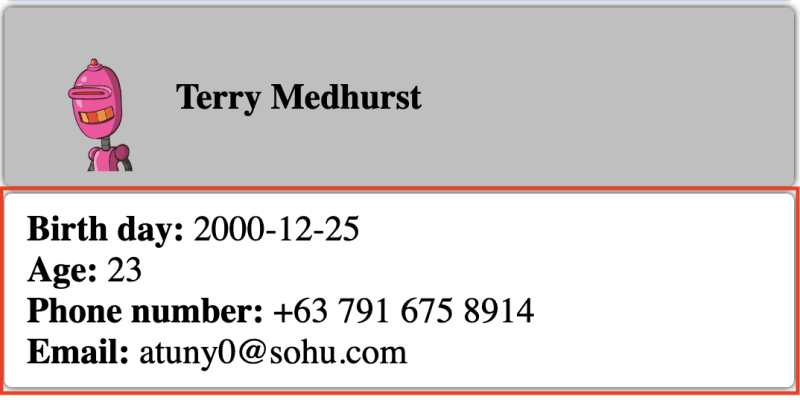
// Tooltip.vue
<script setup lang="ts">
import {
  Teleport,
  computed,
  ref,
  onMounted,
  onBeforeUnmount,
  watch,
} from "vue";

const isMouseOver = ref(false);
const targetRef = ref<HTMLDivElement>();
const dropdownStyle = ref({});
const dropdownRef = ref<HTMLDivElement>();

const existModalElement = document.getElementById("modal");

if (!existModalElement) {
  // add modal element in body to prevent overflow issue
  const modalElement = document.createElement("div");
  modalElement.id = "modal";
  document.body.appendChild(modalElement);
}

const onMouseOver = () => {
  if (isMouseOver.value) {
    return;
  }
  isMouseOver.value = true;
  const dimension = targetRef.value.getBoundingClientRect();
  dropdownStyle.value = {
    width: `${dimension.width}px`,
    left: `${dimension.x}px`,
    top: `${window.scrollY + dimension.y + dimension.height + 5}px`,
  };
};

const onMouseLeave = () => {
  isMouseOver.value = false;
};
</script>

<template>
  <div @mouseover="onMouseOver" @mouseleave="onMouseLeave" ref="targetRef">
    <slot name="default" />
  </div>
  <Teleport to="#modal">
    <div
      ref="dropdownRef"
      :style="dropdownStyle"
      style="position: absolute"
      v-show="isMouseOver"
    >
      <Card>
        <slot name="overlay" />
      </Card>
    </div>
  </Teleport>
</template>
最后,我将把这些组件组合在一起,如下所示。
// UserWithDescription.vue
<script setup lang="ts">
import AppCard from "./Card.vue";
import DescriptionItem from "./DescriptionItem.vue";
import Avatar from "./Avatar.vue";
import UserName from "./UserName.vue";
import UserDescription from "./UserDescription.vue";
import { defineProps } from "vue";

interface Props {
  firstName: string;
  lastName: string;
  image?: string;
  birthDate?: string;
  phone?: string;
  email?: string;
  address?: string;
}

const props = defineProps<Props>();
</script>

<template>
  <AppCard>
    <Avatar :image="image" />
    <div>
      <div>
        <UserName :firstName="firstName" :lastName="lastName" />
      </div>
      <UserDescription v-bind="props" />
    </div>
  </AppCard>
</template>
至于 "员工名录 "页面,我计划由两个部分组成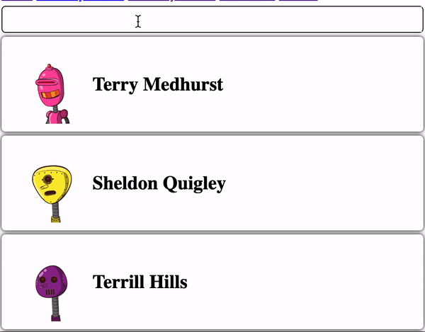
// UserCard.vue
<script setup lang="ts">
    import AppCard from "./Card.vue";
    import DescriptionItem from "./DescriptionItem.vue";
    import Avatar from "./Avatar.vue";
    import UserName from "./UserName.vue";
    import { defineProps } from "vue";

    interface Props {
        firstName: string;
        lastName: string;
        image?: string;
    }

    const props = defineProps<Props>();
</script>

<template>
    <AppCard>
        <Avatar :image="image" />
        <div>
            <div>
                <UserName
                    :firstName="firstName"
                    :lastName="lastName" />
            </div>
        </div>
    </AppCard>
</template>
** UserCardWithTooltip.vue**

// UserCardWithTooltip.vue
<script setup lang="ts">
    import ToolTip from "./Tooltip.vue";
    import UserDescription from "./UserDescription.vue";
    import UserCard from "./UserCard.vue";
    import Card from "./Card.vue";
    import { defineProps } from "vue";

    interface Props {
        firstName: string;
        lastName: string;
        image?: string;
        birthDate?: string;
        phone?: string;
        email?: string;
    }

    const props = defineProps<Props>();
</script>

<template>
    <ToolTip>
        <UserCard v-bind="props" />
        <template #overlay>
            <Card>
                <UserDescription v-bind="props" />
            </Card>
        </template>
    </ToolTip>
</template>
注:你可能会注意到,所提供的解决方案基于原子设计概念。该概念首先可以将 "可重用性 "挑战降至最低。