

- 联系我们
- duidaima.com 版权声明
- 闽ICP备2020021581号
-
 闽公网安备 35020302035485号
闽公网安备 35020302035485号

npm i postcss-pxtorem autoprefixer amfe-flexible --save-devpostcss-pxtorem 是PostCSS的插件,用于将像素单元生成rem单位 autoprefixer 浏览器前缀处理插件 amfe-flexible 可伸缩布局方案 替代了原先的lib-flexible 选用了当前众多浏览器兼容的viewport
module.exports = {
 plugins: {
  autoprefixer: {
   overrideBrowserslist: [
    "Android 4.1",
    "iOS 7.1",
    "Chrome > 31",
    "ff > 31",
    "ie >= 8", // 堆代码 www.duidaima.com
    "last 10 versions", // 所有主流浏览器最近10版本用
   ],
   grid: true,
  },
  "postcss-pxtorem": {
   rootValue: 192, // 设计稿宽度的1/ 10 例如设计稿按照 1920设计 此处就为192
   propList: ["*", "!border"], // 除 border 外所有px 转 rem
   selectorBlackList: [".el-"], // 过滤掉.el-开头的class,不进行rem转换
  },
 },
};
3.main.ts/js 文件中导入依赖import "amfe-flexible/index.js";
4.项目重启
import { ref } from "vue";
  // * 堆代码 www.duidaima.com
export default function windowResize() {
 // * 指向最外层容器
 const screenRef = ref();
 // * 定时函数
 const timer = ref(0);
 // * 默认缩放值
 const scale = {
  width: "1",
  height: "1",
 };

 // * 设计稿尺寸(px)
 const baseWidth = 1920;
 const baseHeight = 1080;

 // * 需保持的比例(默认1.77778)
 const baseProportion = parseFloat((baseWidth / baseHeight).toFixed(5));
 const calcRate = () => {
  // 当前宽高比
  const currentRate = parseFloat(
   (window.innerWidth / window.innerHeight).toFixed(5)
  );
  if (screenRef.value) {
   if (currentRate > baseProportion) {
    // 表示更宽
    scale.width = (
     (window.innerHeight * baseProportion) /
     baseWidth
    ).toFixed(5);
    scale.height = (window.innerHeight / baseHeight).toFixed(5);
    screenRef.value.style.transform = `scale(${scale.width}, ${scale.height})`;
   } else {
    // 表示更高
    scale.height = (
     window.innerWidth /
     baseProportion /
     baseHeight
    ).toFixed(5);
    scale.width = (window.innerWidth / baseWidth).toFixed(5);
    screenRef.value.style.transform = `scale(${scale.width}, ${scale.height})`;
   }
  }
 };

 const resize = () => {
  clearTimeout(timer.value);
  timer.value = window.setTimeout(() => {
   calcRate();
  }, 200);
 };

 // 改变窗口大小重新绘制
 const windowDraw = () => {
  window.addEventListener("resize", resize);
 };

 // 改变窗口大小重新绘制
 const unWindowDraw = () => {
  window.removeEventListener("resize", resize);
 };

 return {
  screenRef,
  calcRate,
  windowDraw,
  unWindowDraw,
 };
}
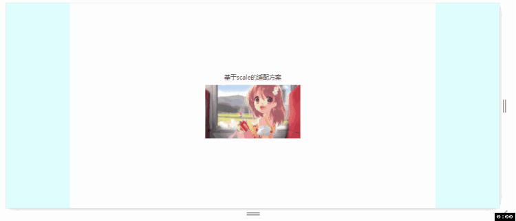
2.相关界面引入resize.ts/js<template>
<div class="screen-container">
<div class="screen-content" ref="screenRef">
<span class="screen-title">基于scale的适配方案-堆代码 www.duidaima.com</span>
<img class="screen-img" src="https://img2.baidu.com/it/u=1297807229,3828610143&fm=253&fmt=auto&app=138&f=JPEG?w=500&h=281" alt="">
</div>
</div>
</template>
<script setup lang="ts">
import windowResize from '../../utils/resize';
import {onMounted, onUnmounted} from 'vue';
const { screenRef, calcRate, windowDraw, unWindowDraw } = windowResize()
onMounted(() => {
// 监听浏览器窗口尺寸变化
windowDraw()
calcRate()
})
onUnmounted(() => {
unWindowDraw();
})
</script>
<style lang="scss" scoped>
.screen-container {
height: 100%;
background-color: lightcyan;
display: flex;
justify-content: center;
align-items: center;
.screen-content {
width: 1920px;
height: 1080px;
background-color: #fff;
display: flex;
justify-content: center;
align-items: center;
flex-direction: column;
.screen-title {
font-size: 32px;
}
.screen-img {
margin-top: 20px;
}
}
}
</style>