
- 联系我们
- duidaima.com 版权声明
- 闽ICP备2020021581号
-
 闽公网安备 35020302035485号
闽公网安备 35020302035485号

from matplotlib import pyplot as plt

x = range(2, 26, 2)
y = [15, 13, 14, 5, 17, 20, 25, 26, 24, 22, 19, 15]
# 全局变量fig figure方法(figsize画板尺寸=(长float,宽float), dpi=整数int)
fig = plt.figure(figsize=(20, 8), dpi=80)
# 传入X坐标和Y坐标,并绘图
plt.plot(x, y)
# 调整X轴刻度,传入的列表密集与否,决定X轴的密集程度
plt.xticks(x)
# 调整X轴刻度同理
plt.yticks(range(min(y), max(y)+1))
# savefig方法,传入一个路径
plt.savefig("./t1.png")
# 展示
plt.show()

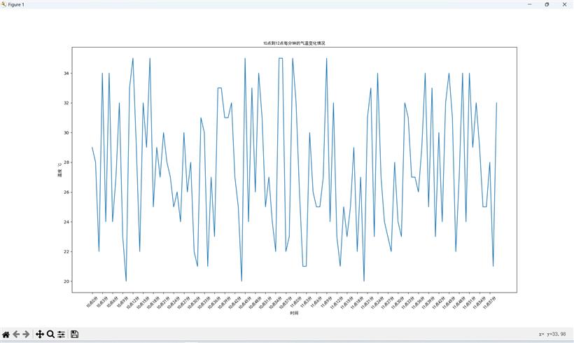
from matplotlib import pyplot as plt
import random
from matplotlib import font_manager

x = range(0, 120)
y = [random.randint(20, 35) for i in range(120)]

# C:\Windows\Fonts\simhei.ttf 字体路径
# 实例化font_manager 堆代码 www.duidaima.com
my_font = font_manager.FontProperties(fname="C:\Windows\Fonts\simhei.ttf")
plt.figure(figsize=(20, 8), dpi=80)

plt.plot(x, y)

# 调整x轴的刻度
_xtick_labels = ["10点{}分".format(i) for i in range(60)]
_xtick_labels += ["11点{}分".format(i) for i in range(60)]

# 取步长,数字和字符串一一对应,数据的长度与数据的刻度一笔一致
# param: rotation=旋转角度(int)
# param: fontproperties=实例化的字体(object)
plt.xticks(list(x)[::3], _xtick_labels[::3],
           rotation=45, fontproperties=my_font)
# 添加描述信息
plt.xlabel("时间", fontproperties=my_font)  # X轴标签
plt.ylabel("温度 ℃", fontproperties=my_font)  # Y轴标签
plt.title("10点到12点每分钟的气温变化情况", fontproperties=my_font)  # 标题

plt.show()
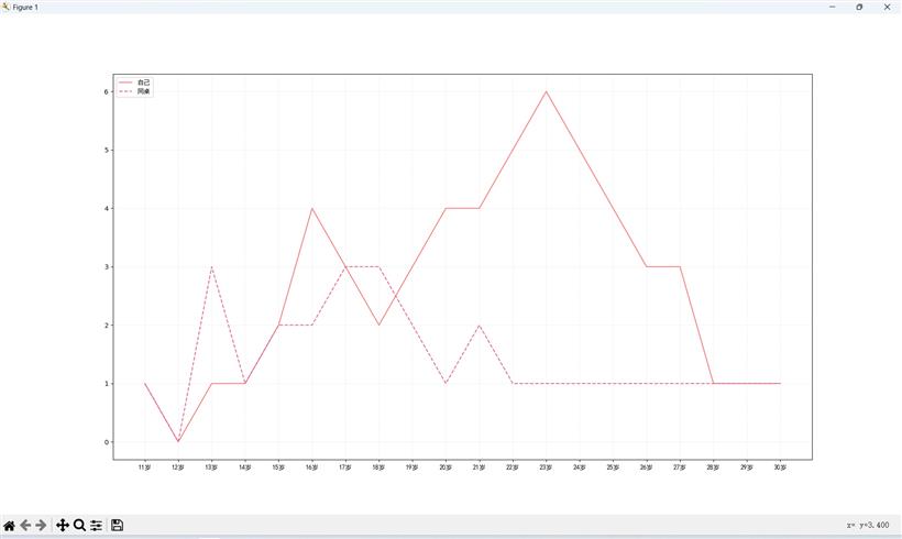
# coding=utf-8
from matplotlib import pyplot as plt
from matplotlib import font_manager

my_font = font_manager.FontProperties(fname="C:\Windows\Fonts\simhei.ttf")

y_1 = [1, 0, 1, 1, 2, 4, 3, 2, 3, 4, 4, 5, 6, 5, 4, 3, 3, 1, 1, 1]
y_2 = [1, 0, 3, 1, 2, 2, 3, 3, 2, 1, 2, 1, 1, 1, 1, 1, 1, 1, 1, 1]

x = range(11, 31)

# 设置图形大小 堆代码 www.duidaima.com
plt.figure(figsize=(20, 8), dpi=80)

plt.plot(x, y_1, label="自己", color="red")
plt.plot(x, y_2, label="同桌", color="#DB7093", linestyle="--")

# 设置x轴刻度
_xtick_labels = ["{}岁".format(i) for i in x]
plt.xticks(x, _xtick_labels, fontproperties=my_font)
# plt.yticks(range(0,9))

# 绘制网格
plt.grid(alpha=0.4, linestyle=':')

# 添加图例
plt.legend(prop=my_font, loc="upper left")

# 展示
plt.show()
绘制折线图总结